How to Trade Forex Using the Ichimoku Cloud Indicator

How to Trade Forex Using the Ichimoku Cloud Indicator

Understanding the Ichimoku Cloud Indicator

The Ichimoku Cloud, also known as the Ichimoku Kinko Hyo, is a technical analysis tool that tries to do several things at once: identify trend direction, highlight momentum shifts, and mark potential support and resistance areas. If you’ve ever stared at a chart full of lines and thought, “I just want something that tells me what the market is doing,” Ichimoku is one of the more disciplined ways people try to solve that problem.

This indicator is used most often in forex, but it’s not limited to it. Traders apply it to stocks, ETFs, commodities, and indices, especially when a chart needs structure—trend clarity, not astrology. The Ichimoku Cloud’s main charm is its visual summary: multiple calculations land on one chart area so you can interpret price action and market balance quickly.

Why Ichimoku looks “busier” than other indicators

Most indicators are either trend-following (moving averages) or momentum-type tools (oscillators). Ichimoku combines multiple roles and also includes forward- and backward-projected data. That’s why it looks like a chart trying to communicate in full sentences rather than a single number.

It helps to think of Ichimoku as a system with layers:

1) What the recent highs/lows suggest (short-term)
2) What a slightly slower view suggests (medium-term)
3) Where price might interact in the future (forward-projected cloud)
4) What price did before, and whether it lines up with the current move (lagging span)

Once you accept that the cloud is doing more than “moving average stuff,” the rest starts making sense.

Components of the Ichimoku Cloud

The Ichimoku Cloud consists of five lines. Each one is derived from high and low prices over different time windows, then positioned on the chart with either forward projection or backward plotting.

Tenkan-sen (Conversion Line): The Tenkan-sen is calculated as the average of the highest high and the lowest low over the past nine periods. It’s often treated as a short-term momentum gauge. When price is above the Tenkan-sen, traders usually interpret that as near-term bullish pressure. When price is below, it suggests near-term bearish pressure. Tenkan-sen can move relatively quickly, so it reacts earlier than slower lines.

Kijun-sen (Base Line): This line represents the average of the highest high and the lowest low over the past 26 periods. The Kijun-sen is the medium-term reference. Because it uses a longer window than Tenkan-sen, it tends to be less reactive and more “steady.” Traders use it to judge whether the market is broadly accepting bullish or bearish terms.

Senkou Span A (Leading Span A): Senkou Span A is created by averaging the Conversion Line (Tenkan-sen) and the Base Line (Kijun-sen), then projecting that value 26 periods ahead. This forward projection is a core part of Ichimoku’s design: it creates a “future” zone that price may revisit.

Senkou Span B (Leading Span B): Senkou Span B averages the highest high and the lowest low over the past 52 periods and also projects it 26 periods forward. This forms the other boundary of the cloud, giving the cloud its height (thickness) and implied strength.

Chikou Span (Lagging Span): The Chikou Span is the current closing price plotted 26 periods back on the chart. It’s the lagging line—useful for confirmation. Traders compare where current price sits relative to where it was, which can confirm or challenge trend interpretations.

What those lines mean in plain language

If you don’t want to memorize the formulas, you can interpret Ichimoku using this mental model:

– Tenkan-sen: short-term turning point
– Kijun-sen: medium-term “fair value” or trend filter
– Senkou Span A and B: the projected trade zone (cloud)
– Chikou Span: a confirmation check using where price used to be

This interpretation approach matters because many traders fail Ichimoku not because the indicator is wrong, but because they apply the wrong line for the wrong question.

Interpreting the Ichimoku Cloud

The Ichimoku Cloud isn’t just a chart decoration. It’s a map of market balance between buyers and sellers. Different parts of the system answer different questions: is the market trending? where might it stall? is momentum strengthening or fading?

Trend Identification: A common rule is that when price is above the cloud, the broader bias is bullish. When price is below the cloud, the bias is bearish. When price is inside the cloud, the market is often considered to be consolidating—less commitment, more indecision.

Traders should treat “price inside the cloud” as a warning label, not a free ticket. Direction can still emerge, but the probability edge from Ichimoku tends to weaken when price stays tangled within the cloud.

Support and Resistance: The cloud itself acts as dynamic support and resistance. Because Senkou Span A and Senkou Span B represent two projected boundaries, the cloud changes over time and can form a shifting barrier.

In an uptrend, traders often watch the top or upper edge of the cloud for support. In a downtrend, the lower edge of the cloud becomes the more watched boundary. Another practical detail: cloud thickness matters. A thicker cloud visually suggests that the market has more “work” to do to break through. Many traders interpret thicker clouds as stronger zones, while thin clouds can behave more like temporary levels.

Momentum Analysis: Tenkan-sen and Kijun-sen act like moving-average cousins, using equilibrium over different windows. When Tenkan-sen crosses above Kijun-sen, it’s often treated as bullish momentum. When Tenkan-sen crosses below Kijun-sen, it’s often treated as bearish momentum.

The point is not that every crossover automatically becomes a trade. The point is that crossovers can help confirm what the cloud suggests. When a crossover agrees with the price’s position relative to the cloud, traders usually consider that a stronger signal than a crossover fighting the cloud.

How to read Ichimoku without getting lost

It helps to run through a simple checklist like you’re inspecting a car before a long trip:

1) Where is price relative to the cloud?
2) Is the cloud rising or falling (in the direction of the bias)?
3) Where are Tenkan-sen and Kijun-sen relative to each other?
4) Is Chikou Span aligned with the trend (as confirmation)?
5) Are you near a recent swing high/low or a major chart level?

You don’t need to apply every step mechanically, but you do need a process. Otherwise, Ichimoku can feel like you’re arguing with your chart instead of reading it.

Core Ichimoku Concepts Traders Actually Use

Ichimoku has rules, but it also has habits. Different brokers and chart platforms can color clouds differently, and different communities use slightly different interpretations. That said, the practical trading logic stays similar. The sections below focus on the concepts traders most often reference during real sessions.

Cloud thickness: more than a visual trick

The space between Senkou Span A and Senkou Span B is the Ichimoku cloud. When that space is wide, the cloud is thick. Traders often interpret this as higher “effort” required for price to break through and hold on the other side.

In practice, thick clouds tend to coincide with zones where price has changed hands more often. That can mean more liquidity and more decision-making. Thin clouds, by contrast, can form when market structure is less committed, such as during transitions or weaker participation.

This isn’t a guaranteed law of physics. But in live markets, probability tends to reward players who respect major zones.

Cloud direction and slope

The cloud is projected 26 periods ahead, but it also visually shows how the projected boundaries are moving. When the cloud “leans” upward, it aligns with bullish expectations. When it leans downward, it aligns with bearish expectations.

For traders, this is useful because a rising cloud can support the idea that dips are more likely to be bought. A falling cloud can support the idea that bounces are more likely to be sold. Again, not guaranteed, but it gives you a directional context that pairs well with how you’d set entries and stops.

Breakouts from the cloud: when they’re worth caring about

One of the most popular Ichimoku approaches is trading breakouts from the cloud. The underlying logic is simple: if price was previously accepted inside a balance zone and then it breaks out decisively, the market may be transitioning from “debate” to “agreement.”

To judge whether it’s a real breakout, traders watch for:

– the breakout occurring with price closing beyond the cloud boundary
– follow-through instead of instant rejection
– alignment with Tenkan-sen / Kijun-sen signals
– the cloud’s slope supporting the direction

A quick poke above the cloud that immediately snaps back is often just noise. The market loves to do that. If you’ve ever been faked out during a thin news morning, you already understand why.

Chikou Span confirmation: the calm check

Chikou Span can give confirmation by showing where the current closing price sits relative to where it was 26 periods ago.

Traders commonly look at whether the Chikou line is above or below past price areas. If the lagging line supports the direction suggested by the cloud and crossovers, traders interpret that as confirmation. If it conflicts, some traders either avoid the trade or reduce position size.

Because Chikou Span is lagging, it can also feel slow. That’s the point. It’s meant to reduce “I hope it works” trading.

Strategies for Trading Using the Ichimoku Cloud

Ichimoku can be used for many strategies. The common theme among the better ones is that they don’t treat Ichimoku as a standalone oracle. They treat it like a map, then use price action and other indicators to choose good timing.

Breakout Strategy

A breakout strategy focuses on decisive moves out of the cloud.

– Bullish breakout: price emerges above the cloud and holds.
– Bearish breakout: price drops below the cloud and holds.

Traders who like breakout approaches tend to want confirmation before entering because breakouts can fail. If you have ever bought “obviously the trend is starting” only to watch it reverse three candles later, you know why confirmation matters.

How traders often time entries in a breakout setup:
– Wait for a close outside the cloud, not just a wick.
– Look for Tenkan-sen and Kijun-sen to align with the move.
– Consider waiting for a retest of the cloud boundary (if price pulls back but holds).

Risk management matters here because breakouts can whipsaw, especially around major news events or in low-liquidity sessions.

Cross Strategy (Tenkan-sen vs Kijun-sen)

The cross strategy watches the interaction between Tenkan-sen and Kijun-sen.

– A bullish cross happens when Tenkan-sen moves above Kijun-sen.
– A bearish cross happens when Tenkan-sen moves below Kijun-sen.

Many traders give more weight to crosses that occur in certain conditions, such as:
– the crossover happening above the cloud for bullish setups
– or happening below the cloud for bearish setups

The idea is to reduce the chance you’re acting against the bigger structure. Tenkan-Kijun crosses can occur in sideways markets too, and that’s where many traders get chopped up.

Cloud Strategy (Color and Thickness Shifts)

This strategy focuses on changes in the cloud’s properties. The logic is that cloud behavior can hint at a transition between bullish and bearish expectations.

Traders may watch for:
– a shift in cloud area (the cloud boundaries crossing)
– changes in thickness (support/resistance strength)
– price reacting at the cloud boundary

Some traders treat cloud color shifts as a directional hint, but it’s smarter to pair that hint with price action. For example, if price keeps rejecting the cloud boundary, “nice looking color change” might not translate into a good entry.

Range and transition behavior: where Ichimoku needs patience

Not every market phase is built for cloud strategies. During range-bound periods, prices can hover near the cloud edges, producing repeated signals that feel like déjà vu. This is where patience and selectivity can outperform constant button-pushing.

Common ways traders adapt:
– use the cloud for bias only, then enter based on breakouts from the range
– reduce trade frequency and require additional confirmation
– use higher timeframes to filter noise on lower timeframes

This isn’t about “using bigger timeframes because influencers say so.” It’s about reducing the number of signals caused by random fluctuations.

Practical considerations before going live

Backtesting is boring in the same way seatbelts are boring. They’re not fun, but they help. Before using Ichimoku Cloud signals in live trading, it’s worth testing the exact rules you plan to execute:

– Which chart timeframe do you trade?
– Do you enter on close or on intrabar signals?
– Are you using cloud breakout rules or cross rules?
– How do you set stops—behind Kijun-sen, behind the cloud, or using a fixed risk model?
– What’s your exit logic? Opposite signal? trailing stop? time-based exit?

A demo account can also help you understand how the indicator behaves in real-time candles. Sometimes the signal you see after a candle closes looks different from the signal you see while the candle is still forming. That gap—between live forming and confirmed close—matters.

Combining Ichimoku with other indicators

Many traders combine Ichimoku with additional indicators to improve timing and reduce false signals. The most common combinations are trend-following confirmation and volatility context.

You mentioned Bollinger Bands and MACD, which are popular pairings:

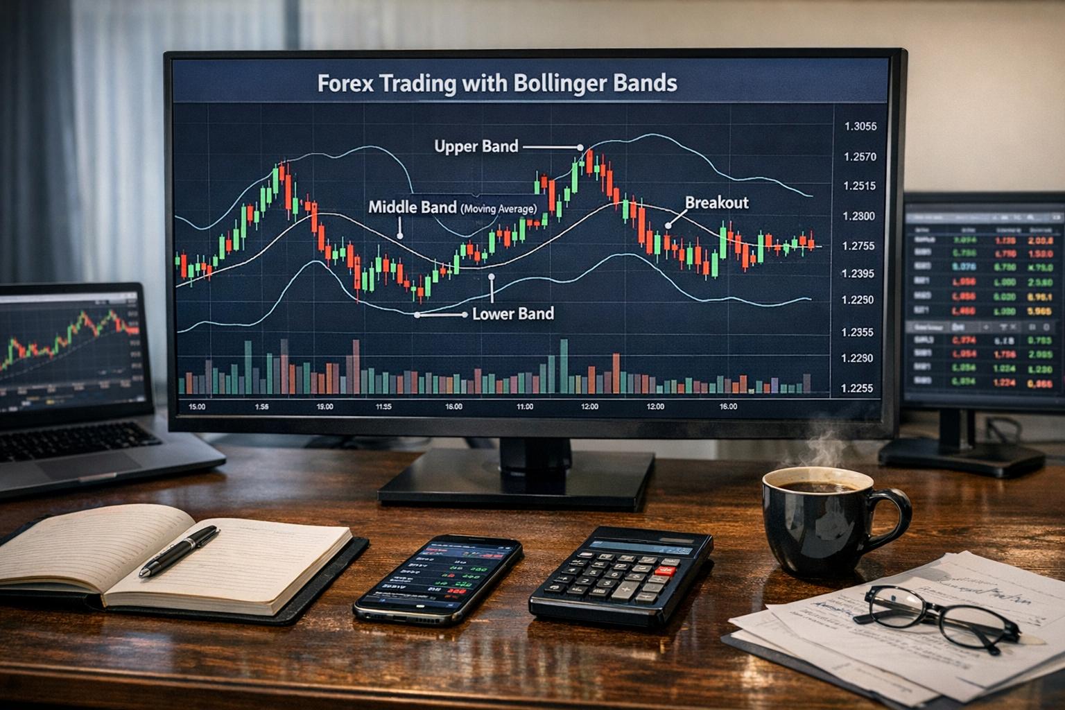
Bollinger Bands: These help you understand volatility and whether price is stretching away from recent averages. In Ichimoku terms, Bollinger Bands can help you judge whether a breakout has enough “wind” (volatility expansion) to follow through.

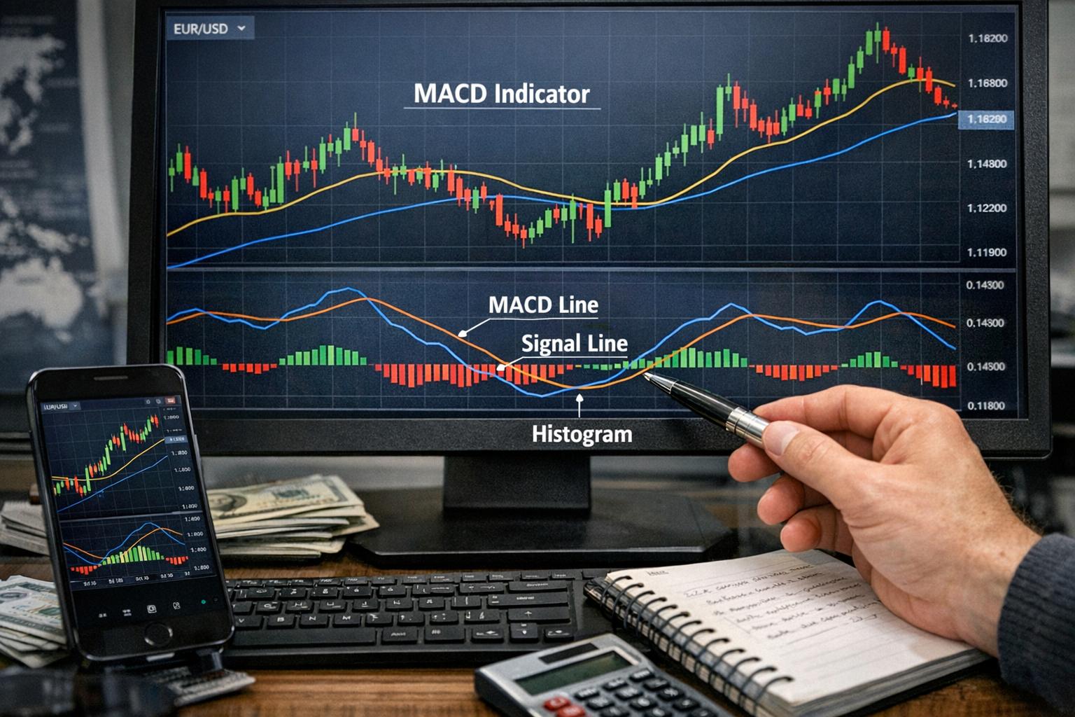
Moving Average Convergence Divergence (MACD): MACD provides momentum confirmation through its histogram and signal line behavior. Traders often look for momentum support when Ichimoku suggests a trend direction change.

The key is not to stack indicators until you have a spreadsheet. Two tools that answer different questions can help. A pile of tools usually helps nobody.

Common Ichimoku Mistakes (and How Traders Usually Fix Them)

Ichimoku is forgiving in some ways and unforgiving in others. Here are the mistakes that show up repeatedly among traders who get frustrated with the indicator’s “mixed signals.”

Using Ichimoku as a standalone strategy

Ichimoku provides a lot of context, but it still needs execution rules. Without those rules, you’ll end up reacting to whatever the chart shows at that moment. That typically means inconsistent entries and random exits.

The fix is simple: write your entry, stop, and exit rules before you trade. Treat it like a plan, not a vibe check.

Ignoring timeframe alignment

A signal on the lower timeframe might clash with the cloud bias on the higher timeframe. That can create a lot of “almost trades” and then sudden disappointments.

If you want fewer surprises, use higher timeframe structure for bias and lower timeframe signals for timing. You can still trade short-term, but you don’t want your “direction” to be random.

Chasing signals inside the cloud

Price inside the cloud is often a consolidation environment. It can still trend eventually, but it’s where many traders get trapped in repeated entries and exits.

Instead of trading every tiny move inside the cloud, many traders wait for:
– price to push out and close beyond the cloud
– alignment with Tenkan-sen/Kijun-sen behavior
– a retest that holds

Overreacting to a single crossover

Crossover signals can occur frequently during volatile sideways conditions. One crossover can be a turning point. Or it can be a false start.

A more reliable approach is to require the crossover to align with cloud position and sometimes Chikou Span confirmation. Not always, but enough to reduce noise.

Confusing “wick” moves with confirmed breakout

It’s easy to see a wick poke through the cloud and think “breakout.” But if the candle closes back inside, your signal wasn’t confirmed.

If you trade near the edges of the cloud, treat candle close as the confirmation point. You’ll likely reduce a lot of small losses that don’t feel like losses—until you add them up.

How to Set Up an Ichimoku Workflow

A lot of traders don’t struggle with Ichimoku because they can’t interpret it. They struggle because they don’t have a workflow. Here’s a practical rhythm you can use, even if you’re not the kind of person who likes checklists.

Step 1: Determine bias from price vs cloud

Start with the most visual rule: where is price relative to the cloud?

– Price above cloud: bullish bias
– Price below cloud: bearish bias
– Price inside cloud: range/transition bias

Then look at the cloud slope. If the cloud leans with the bias, you get better odds. If it leans against the bias, expect more friction.

Step 2: Use Tenkan-sen and Kijun-sen for timing confirmation

When bias is bullish, you typically want Tenkan-sen that supports upward movement relative to Kijun-sen. When bias is bearish, you want the opposite alignment.

This doesn’t mean every cross triggers an entry. Think of crossovers as “the market is showing its hand,” not “you must trade right now.”

Step 3: Accept that Chikou may lag but still helps

Chikou Span is a confirmation tool. In practice, many traders use it to avoid the worst trades rather than to identify perfect ones.

If the rest of the system suggests a bullish move and Chikou Span conflicts, you might skip the trade or reduce exposure.

Step 4: Manage risk using realistic levels

Ichimoku naturally suggests zones: cloud boundaries, Tenkan-sen, Kijun-sen. But the final level setup depends on your risk model.

Some common approaches:
– stop behind the cloud boundary
– stop behind Kijun-sen for trend-related trades
– stop based on recent swing structure instead of only indicator lines

It’s fine to use indicator levels, but always check whether they make sense relative to actual swing highs/lows. Indicator lines are helpful until they aren’t.

Real-World Examples of How Traders Use Ichimoku

A couple of scenario-style examples make the indicator easier to apply. These are descriptive rather than predictive, because markets love to be difficult.

Example: Bullish breakout on a major pair

Imagine a forex pair that spent several sessions moving in and around the cloud. Then a strong bullish sequence appears and price closes above the cloud with Tenkan-sen rising above Kijun-sen. Traders who follow Ichimoku breakout logic would typically interpret this as a transition from consolidation to trend.

They might not enter immediately on the breakout candle, depending on their rules. A retest of the cloud boundary that holds can offer a better entry. If price rejects the breakout and returns into the cloud, the trade idea weakens quickly.

Example: Bearish signal that fails because the cloud is thick

Now imagine price drops below the cloud briefly, triggering a bearish breakout idea. But if the cloud is thick and the market snaps back, the breakout may have been an aggressive move rather than a sustained change.

In these cases, traders often learn not to interpret every dip as a trend reversal. The thick cloud can act like a sturdy barrier where price interacts repeatedly before deciding. Patience is not glamorous, but it pays.

Example: Tenkan-Kijun cross while price is inside the cloud

A classic frustration: Tenkan-sen crosses Kijun-sen, but the price is still inside the cloud. Some traders take the signal anyway and get chopped up. Others wait for price to exit the cloud in the direction of the cross.

That difference in selectivity is often the difference between “Ichimoku is unreliable” and “Ichimoku is doing exactly what it’s supposed to do.”

Which Timeframes Work Best with Ichimoku Cloud?

Ichimoku Cloud can be used on many timeframes, but signal quality tends to vary depending on volatility and market structure.

Short-term trading

On shorter timeframes, the cloud can react faster, and signals appear more frequently. This can be good for active trading. It can also increase the number of false starts, especially around news events and during low-liquidity periods.

If you trade short-term, keep your filters tight. Consider requiring cloud breakout close confirmation and aligning with higher timeframe bias.

Swing trading

Swing trading often pairs well with Ichimoku because the cloud updates gradually and reflects market structure. Traders can watch for cloud breaks and trend confirmations over days rather than minutes.

This doesn’t mean swing trading is “easy.” It means it can be less noise-heavy.

Longer-term investing

Ichimoku can also be applied to longer-term charts. Here, the goal usually isn’t frequent trading. The goal is bias and major support/resistance zones. Chikou Span can provide useful confirmation in slower markets, where structure shifts less often.

Longer-term use also gives you more time to manage risk and reduce reactionary decisions.

How to Evaluate Ichimoku Results Without Fooling Yourself

Because Ichimoku is visual and multi-signal, there’s a risk of “storytelling.” You’ll sometimes see a chart move and then convince yourself the indicator predicted it nicely. That’s satisfying. It’s also dangerous if it happens in your backtests and then stops happening in live trading.

Use clear performance metrics

Track things that matter:
– win rate and average win/loss
– maximum drawdown
– profit per trade and profit factor
– how often your trades were aligned with cloud bias

If your strategy only works when it “feels right,” it’s not a strategy. It’s a diary entry with trades attached.

Watch for regime shifts

Ichimoku signals can behave differently across market regimes: trending markets often reward cloud breakout logic better, while sideways regimes often benefit from range-aware rules.

You don’t need to predict the regime perfectly. You just need to stop using the same entry logic in all conditions.

Backtest with the exact rules you’ll use

If you plan to enter on candle close beyond cloud boundaries, make sure your backtest does that. If you plan to use retests, ensure the rules match. If you plan to avoid trades when price is inside the cloud, enforce that filter in both backtests and live execution.

Small differences between “what I meant” and “what I coded” cause a lot of hurt feelings.

Conclusion

The Ichimoku Cloud Indicator is a versatile tool for traders who want a structured way to read trend, momentum, and potential support/resistance levels from one chart. By understanding what each line is doing—Tenkan-sen and Kijun-sen for short-to-medium momentum, Senkou Span A and B for projected interaction zones, and Chikou Span for confirmation—you can turn a busy chart into a consistent decision framework.

Like any trading tool, it’s not magic. It works best when you respect its signals, confirm them with a clear process, and manage risk with levels that make sense for the market you’re trading. If you treat Ichimoku as a system rather than a single “buy/sell” prompt, it can earn its place on your chart.

The Role of High-Frequency Trading in the Forex Market

The Role of High-Frequency Trading in the Forex Market

Introduction to High-Frequency Trading (HFT) in the Forex Market

High-Frequency Trading (HFT) has become a regular feature of modern financial markets, and the Foreign Exchange (Forex) Market is no exception. In plain terms, HFT is trading performed by computers that can submit orders in fractions of a second, then do it again—fast. Instead of relying on a human reading charts and waiting for confirmation, HFT systems use algorithms to react to price changes almost as soon as the market prints them.

In the Forex Market, HFT has shaped how trading works in a few practical ways. It can improve liquidity and often reduces bid-ask spreads, which means transactions can be cheaper. At the same time, it can also introduce complicated regulatory questions and ethical concerns, especially when machine speed becomes an advantage that ordinary market participants can’t easily match. If you trade FX directly, or you work with execution systems, it’s worth understanding what HFT is doing in the background—even if you never intend to run a strategy yourself.

How High-Frequency Trading Works

At the center of HFT is the idea that speed plus data plus automation can extract profit from short-lived market inefficiencies. HFT strategies are coded into computer programs that consume market information, evaluate it against predefined rules, and place trades within microseconds to milliseconds, depending on the setup.

Most HFT firms use combinations of:

– Market data feeds (price, order-book updates where available, and related signals)
– Statistical models (to estimate probabilities rather than “certainty”)
– Execution engines (to route orders to venues and manage slippage)
– Risk controls (to prevent runaway losses if the market behaves unexpectedly)

HFT firms aim to translate tiny market movements into repeatable gains. That doesn’t require the strategy to be right every time—what matters is the statistical edge, the cost structure, and whether the system can execute with consistent quality.

Algorithms, Latency, and Why Speed Matters

A useful way to think about HFT is that it’s trading under a strict timing budget. Latency—the delay between receiving information and sending an order—can decide whether your order is positioned before price moves or after it already slipped past your intended level.

In competitive FX trading, firms invest in faster infrastructure: improved server placement, optimized network paths, and hardware tuned for low-latency processing. They also optimize how code handles market updates so that decisions happen quickly and predictably.

The point isn’t just “going fast.” It’s getting the right order submitted at the right moment with minimal overhead. A slower system might still be smart, but if it responds after the market has moved, the profit opportunity may be gone.

Exploiting Arbitrage Opportunities

The clear profit idea behind much HFT is reacting to arbitrage opportunities. In an ideal world, identical or closely related prices across venues would line up perfectly. Real markets aren’t ideal. Different trading platforms can show slight timing differences, fragmented liquidity, or brief mismatches in how instruments are priced.

Examples of where mismatches can appear include:

– Timing differences between related instruments (or related currency pairs)
– Imperfect pricing across market venues
– Short-lived effects from large orders hitting the market
– Brief dislocations caused by changing liquidity conditions

HFT doesn’t have to hold positions for long to benefit. The “window” for these opportunities is often tiny, which is why HFT firms focus on speed and automated execution. A human trader can spot an inconsistency after the fact; the HFT trader tries to trade it while it still exists.

Order Types and Execution Tactics

HFT doesn’t just “buy and sell.” It uses the mechanics of trading to shape outcomes. Depending on the strategy, an HFT system may:

– Submit limit orders rather than market orders to control entry prices
– Use short-term holding periods to reduce exposure
– Cancel and replace orders quickly to stay aligned with the evolving order book
– Adjust order sizes to match liquidity and minimize adverse selection

In FX, where market structure can be less centralized than in some other asset classes, execution behavior becomes part of the strategy. Two traders with the same pricing logic may end up with very different results because one of them executes efficiently and the other doesn’t.

Impact on the Forex Market

The presence of HFT in the Forex market creates measurable market effects. Some are good news for traders; others are more complicated.

Increased Liquidity: One of the most cited effects of HFT is higher liquidity. HFT firms continuously participate by buying and selling, which increases the number of orders available at different prices. When other participants want to trade, they can often find counterparts faster, and trades are more likely to execute without large slippage.

Reduction in Bid-Ask Spreads: Bid-ask spreads often narrow when competition is high. With more participants submitting orders at many price levels, the market tends to display tighter pricing. In practical terms, that can make FX trading cheaper for everyone using normal execution flows.

Market Volatility: Liquidity improvements don’t automatically mean “calm markets.” HFT can sometimes intensify short-term volatility, especially during stressed conditions. If algorithms react quickly to the same signals, they can also amplify moves by rapidly adjusting quotes and orders in the same direction.

When Liquidity Improves and When It Doesn’t

It’s tempting to assume that more liquidity is always better. Usually, it is. But liquidity can be “real” or “conditional.” In some market conditions, liquidity providers may widen spreads, reduce quoted depth, or become less willing to trade until uncertainty fades.

During sudden news releases, risk-off/risk-on shifts, or broad market de-risking, HFT liquidity can change character quickly. In those moments, spreads can widen, execution can become sloppier, and strategies that depend on tight micro-moves may struggle to get filled at expected prices.

For traders and portfolio managers, this matters because execution quality often becomes the story, not just the direction of price.

Challenges and Concerns

HFT’s speed and scale bring legitimate concerns. Some involve market integrity; some involve fairness; some involve the real risk that markets behave differently than models predict.

Regulatory Challenges: Regulating high-speed trading is hard because the actions are fast, the data volume is massive, and the strategies can be opaque. Regulators also have to detect manipulation-like behaviors without blocking normal competition. There’s a constant tension: allow innovation, but don’t let speed be used to break the rules. Regulatory frameworks are continuing to evolve as authorities learn where the real risks appear.

Ethical Issues: HFT often creates an uneven playing field because speed-related advantages are expensive to obtain. If one participant has faster data access and better execution infrastructure, it can trade ahead in ways others can’t match. That raises fairness debate, especially when strategies like front-running are suspected. Front-running, in general terms, involves acting on information about upcoming orders before other market participants can respond. Even if the exact mechanics vary by market and jurisdiction, the ethical concern is the same: is everyone playing with the same rules, or with different clocks?

Operational Risks: When Algorithms Stop Behaving

Another issue that gets less attention in public discussions is the operational risk of algorithmic trading itself. HFT strategies rely on code, data feeds, and trading infrastructure. If something goes wrong—bad data, a misconfigured risk limit, a malfunctioning order router—the system can place orders incorrectly at high speed.

This is why reputable firms use multiple layers of safeguards:

– Hard risk limits (max loss, max position, max order rate)
– Execution sanity checks (reject orders that violate constraints)
– Monitoring and kill switches (ability to stop trading quickly)

Even with safeguards, the probability of “something weird” isn’t zero. Markets are living systems; they react to events; sometimes they gap through levels, or thin out. HFT models that assume stable conditions can fail when conditions become unstable.

Front-Running and Market Integrity: What’s the Real Dispute?

Front-running is often discussed in broad, moral terms, but the practical dispute is usually about how information and order flow are used. Regulators worry about actions that are used to profit from others’ intentions rather than from legitimate market signals.

What makes this messy is that not all “fast trading” is front-running. Many traders place orders simultaneously based on public information, and they can legitimately compete. But when a trader seems to react to non-public order flow (or to infer it in a way regulators interpret as unfair), scrutiny rises.

For FX, the harder part is mapping market conduct to specific regulatory categories. That’s because FX trading can involve multiple venues, counterparties, and varying reporting rules. The same behavior can be interpreted differently depending on where and how it occurs.

Future of HFT in the Forex Market

The future of HFT in FX won’t be driven only by technology. Regulation, market structure changes, and data availability will matter just as much. Here are the trends that, in practice, are likely to influence HFT’s next phase.

As computing power continues improving, algorithms can become more adaptive. But “more adaptive” doesn’t automatically mean “better outcomes.” Markets can change regime fast, and aggressive systems can worsen during regime shifts.

Regulators, meanwhile, will keep tightening oversight where they believe risks are highest. That might mean improved reporting requirements, more robust controls on order handling, and clearer enforcement around abusive practices.

At the firm level, competition also shapes strategy. If more participants adopt similar execution approaches, the edge shrinks. HFT firms respond by improving models, changing how they source data, and adjusting execution tactics.

For those seeking the latest information and discourse on HFT, numerous resources and expert insights are readily available on platforms such as Bloomberg and Financial Times. These platforms provide valuable perspectives on the ramifications of HFT on global trading structures and their transformative impact on financial markets.

Market Structure in Forex: Why HFT Becomes Relevant

To understand why HFT fits into Forex, it helps to look at what FX trading is like compared with other asset classes. Forex is global, continuously active, and often traded through networks of counterparties. Liquidity tends to vary by time of day, regional participation, and market events.

This kind of environment is fertile ground for short-horizon strategies. Small mispricings can occur when:

1) Liquidity is thin in a given moment
2) Execution routes differ across counterparties
3) News or risk events hit and participants react asynchronously
4) Quoting behavior changes faster than longer-horizon participants can adjust

With HFT, the reaction speed advantage can translate into better mid-price positioning, improved fills, and more favorable order status outcomes (filled vs partially filled vs missed).

How Different FX Sessions Affect HFT Behavior

FX trading hours overlap major financial centers, but not all currency pairs behave the same at every time. HFT strategies often account for session effects because order-book depth and volatility differ from London morning to New York close.

During periods of strong liquidity, HFT strategies can quote tighter spreads and manage inventory more predictably. During thin liquidity periods, a firm may widen spreads, reduce order rates, or stop quoting temporarily if predicted risk rises.

This is one of the practical reasons you’ll see performance change across the day for HFT firms—even when the strategy looks similar on paper.

Liquidity Provision vs Directional Trading

Some HFT strategies act like liquidity providers: placing orders near the market to earn spread and manage inventory exposure with quick adjustments. Others act more directionally: they try to predict short-term price changes from microstructure signals.

In practice, many competitive firms blend both modes. For example, they may provide liquidity most of the time but shift behavior during event windows such as economic releases or sudden volatility spikes.

What HFT Strategies Typically Look Like in Practice

HFT isn’t a single strategy type. It’s a category of execution speed and automation. Still, there are common patterns.

Statistical Arbitrage in Micro Timeframes

Some strategies attempt to forecast short-run mispricing using statistical signals. They don’t need a long view. They need “is this mispricing likely to persist for the next few milliseconds or seconds?”

This often involves:

– Monitoring spreads and relationships between pairs or venues
– Estimating whether pricing errors are mean-reverting
– Executing fast enough to capture the expected reversion

These strategies can be sensitive to sudden regime change. When volatility changes, correlations can shift, and statistical signals can stop working.

Market-Making and Inventory Management

Market-making strategies place two-sided quotes (buy and sell) to earn the spread. But in real systems, you also manage inventory. If you only buy aggressively, you end up short the wrong currency. If you only sell, you end up long. Inventory risk is where a lot of HFT logic lives.

Good market-making systems use:

– Short holding periods
– Hedging logic to reduce net exposure
– Risk limits to prevent runaway positions

The goal is often not to “predict” the future direction perfectly. It’s to make profits when price changes are small and predictable enough, while relying on hedging and fast adjustments to survive bigger moves.

Event-Driven Trading Around Scheduled Releases

FX has a calendar of events: central bank announcements, inflation prints, employment data, geopolitical updates, and more. HFT can react to these in near real time using preconfigured logic.

That doesn’t mean HFT knows what the data will be. It means the system is ready to adjust quickly once the market reprices. Many event-driven systems use:

– Real-time economic release parsing (or fast feed updates)
– Volatility estimators
– Execution strategies tuned for spreads widening during news

If you’ve ever watched spreads widen during a major release, you understand why execution tactics matter. A trader who can place orders quickly and get filled can have a big advantage.

Benefits of HFT in Forex (Beyond the Marketing Claims)

Most discussions of HFT focus on two benefits: liquidity and tighter spreads. Those are real in many conditions, but there’s more behind the scenes.

Tighter Spreads Can Lower Trading Friction

When bid-ask spreads narrow, transaction costs typically fall. Over time, lower friction can improve performance for many types of traders, from hedge funds to corporate FX desks.

Even if you aren’t trading at HFT speeds, you still benefit from the fact that counterparties must compete on price and execution quality.

Better Price Discovery (Sometimes)

HFT can help markets respond faster to new information. If prices adjust quickly, you get faster incorporation of “what changed.” That can make benchmarks and reference prices more informative.

However, fast adjustment can also produce short-lived overshoots—spikes and snaps that later normalize. In other words: faster price discovery doesn’t always mean smoother markets.

More Frequent Two-Way Trading

High-speed activity can increase the frequency of two-way market interactions. For a trader trying to enter and exit without huge slippage, that matters. The market becomes less “lumpy,” especially during periods when deeper liquidity appears.

Downsides and Real-World Costs of HFT

The downside isn’t only philosophical. There are practical costs that show up in execution behavior, volatility patterns, and regulatory attention.

Volatility Can Spike During Stress

In quiet markets, HFT can provide tight spreads. When markets get nervous, speed doesn’t always dampen volatility. If many systems react at once to the same signals, price moves can become sharper in the short run.

This isn’t a law of nature. It’s more like a situation where technology amplifies behavior. When risk appetite changes quickly, fast quoting can create fast pulling-away, and that combination can widen spreads.

Model Risk and “Correlation Death” During Regime Shifts

Many statistical HFT strategies assume some stability: relationships between pairs, mean reversion, predictable liquidity responses. During regime shifts, assumptions break. Correlations can shift suddenly, and the strategy starts trading against its own logic.

HFT firms know this, which is why risk controls are emphasized. But controls are not magic. Even well-designed systems can be hurt by unexpected behavior.

Fairness Concerns (It’s Not Just a Vibe)

Fairness concerns aren’t just about feelings. They show up in competition and market participation. If the advantage is primarily infrastructure speed and data access, the economic cost of entry grows. That can become a barrier for smaller participants.

Regulators worry about whether this barrier turns into market conduct issues: manipulation, abusive order handling, or unfair event exploitation.

Regulation: What Authorities Try to Solve

Regulators aren’t trying to eliminate HFT. Most of the time, the goal is to ensure HFT operates within market integrity rules and doesn’t harm orderly trading.

Order Handling Rules and Transparency

One major area of regulation is order handling: how orders are submitted, canceled, amended, and how their behavior is monitored. Regulators often look for patterns that indicate attempts to generate artificial market activity, or to exploit order flow in unfair ways.

Transparency requirements can also matter. If regulators and market operators can see what’s happening, they can enforce rules more effectively.

Risk Controls and Firm-Level Governance

Another regulatory area is risk governance. Because HFT can act quickly, regulators expect firms to have robust controls:

– Maximum order rates
– Limits on exposure and losses
– Mechanisms for rapidly shutting down trading if something goes wrong

These rules exist because the cost of a malfunctioning system in a fast market can be immediate.

Ongoing Enforcement and Learning

Regulatory agencies learn over time. When they see consistent issues—like a particular kind of abusive practice—they focus on it. When they see that a behavior is legitimate trading competition, they back off. This constant feedback loop is often why regulatory language evolves slowly but steadily.

How Traders Can Cope With HFT-Driven Market Behavior

If you trade FX and you suspect HFT activity affects your fills, you don’t have to pretend HFT doesn’t exist. You can adapt your execution strategy and risk management.

Pay Attention to Execution Quality, Not Just Signals

A common mistake is treating signal accuracy as the whole game. In active markets, and especially in markets with fast liquidity providers, execution and routing determine whether your theoretical trade works in real life.

Watch:

– Slippage versus expected price
– Fill rates for your order sizes
– How spreads behave around releases

Even if you don’t track latency, you can record execution outcomes and see patterns.

Use Order Timing and Order Type Thoughtfully

In markets where fills can change quickly, the way you enter and exit matters. Some order types reduce fill risk; others reduce price sensitivity. Depending on your broker and venue access, you can adjust:

– Whether you use limit vs market orders
– How quickly you revise orders after partial fills
– Whether you avoid certain time windows if spreads become unreliable

Account for Spread Widening Around News

HFT can tighten spreads in calm periods, but spreads often behave differently around major headlines. If your strategy depends on stable transaction costs, you need a plan for the event windows.

For many traders, the practical adjustment is simple: reduce size during high-spread moments, or delay entries until the first chaotic repricing ends. Yes, you might get a slightly worse price. But you also avoid the “paying for volatility” problem.

Examples of HFT Effects You Might Actually See

This section is for the people who want something more concrete than general descriptions. These are patterns traders often notice when HFT is active.

More Liquidity During Regular Hours

A trader placing an order during a busy FX session might find:

– The order fills faster
– Partial fills are less frequent
– The mid-price moves smoothly relative to thin-hour behavior

That can be consistent with HFT liquidity provision.

Fast Spread Changes During Announcements

During major scheduled events, you might observe:

– Bid-ask spreads widening suddenly within seconds
– Quick “snap back” once the headline risk clears
– Less reliable fills if you place orders too late in the reaction window

This behavior often aligns with automated re-quoting by fast participants.

Short-Lived Price Whipsaws

Sometimes you see a brief spike or dip that doesn’t persist. If you trade with slower execution, you might get filled on the wrong side of the moment. That’s a microstructure effect: fast participants can move quotes quickly, while slower traders absorb the mismatch.

Common Misconceptions About HFT

“HFT Always Makes Markets Better.”

It depends on conditions. In many circumstances, HFT improves spreads and liquidity. But during stress periods, it can increase short-term volatility or create quote behavior that makes execution tougher for slower participants.

“HFT Is Only Arbitrage.”

Arbitrage is part of the story, but it’s not the full story. Many strategies aim for spread capture, microstructure forecasting, or event-driven reactions. The category is more about speed and automation than about a single profit method.

“If HFT Exists, Your Trades Are Doomed.”

Not true. Plenty of traders succeed in markets with HFT. The trick is adjusting execution and risk management to realities: spreads change, liquidity changes, and the cost of timing isn’t constant.

HFT’s Long-Term Outlook: More Speed, More Rules

As tech improves, HFT will likely keep evolving. Better models, faster execution stacks, and improved data handling can make strategies more efficient. But rules will also keep tightening, particularly around market integrity, order handling, and transparency.

The most practical expectation is that competition will keep pushing efficiency. That means the “easy money” from obvious inefficiencies fades faster. HFT firms respond by exploring subtler signals and improving execution quality, not just raw speed.

For the Forex market, the likely outcome is a continued mix: liquidity improvements in normal sessions, plus sharper micro-moves around events and stress. Markets remain markets, even when computers run the show.

Conclusion

In conclusion, while High-Frequency Trading offers palpable benefits, such as enhanced liquidity and trading efficiency, it also introduces complexities and nuances necessitating careful consideration from both market participants and regulatory entities. A comprehensive understanding of HFT’s mechanics and implications is vital for any stakeholder operating within the Forex market landscape today. As the technology behind HFT continues to evolve, so too must our frameworks and strategies for integrating and regulating this influential trading approach.

The Relationship Between the U.S. Dollar and Global Currencies

The Relationship Between the U.S. Dollar and Global Currencies

The Role of the U.S. Dollar in Global Economy

The U.S. dollar (USD) does more than buy things in the United States. It quietly sits at the center of global pricing, lending, and financial risk. When you hear commentators talk about “rates,” “resilience,” or “liquidity” in markets, the dollar is often the hidden variable behind the scenes. That’s why it’s worth understanding what the U.S. dollar actually does in the global economy, not just where it’s used.

In practice, the USD influences how central banks manage reserves, how companies fund operations across borders, how commodities get priced, and how investors decide where to park cash when uncertainty shows up. It’s a powerful position—one that comes with both advantages for the United States and responsibilities for the world’s financial system.

Understanding Reserve Currency Status

The U.S. dollar’s reserve currency status means that many central banks and large financial institutions hold USD assets as part of their foreign exchange reserves. Reserves are the stockpile of currencies a country can use to stabilize its own exchange rate, pay for imports, and respond to financial stress.

Central banks hold USD for a simple reason: when the world gets nervous, USD tends to be the currency that’s easiest to use. That reliability reduces the “friction cost” of international finance compared with currencies that might be less liquid or more volatile in global markets.

The reserve status also creates a feedback loop. Because the USD is so widely held, it remains in demand. Because it’s in demand, it remains attractive to hold. That isn’t immortality, but it explains why the dollar keeps showing up in the calculus of global finance.

Why the U.S. benefits from being the reserve currency

One of the most discussed advantages is lower borrowing costs. When global investors already want USD assets, the U.S. typically can issue Treasury debt at competitive rates. Put differently: if many investors will buy your currency-denominated government bonds, the market doesn’t have to be forced to “pay a premium” to attract buyers.

This can reduce interest expenses for the government and, over time, shape broader financial conditions. A country that can borrow cheaply isn’t automatically spending wisely, but it doesn’t face the same immediate funding pressure as a country without that demand.

There’s also an indirect effect. If the world holds dollars, it becomes easier for U.S. companies to raise capital globally and for American financial institutions to operate with depth in funding markets.

Why other countries hold USD anyway

It’s tempting to assume other countries hold USD only because they “trust” the U.S. economy. That’s only part of the story. Many countries need USD to meet practical obligations: international trade is often settled using USD, and some financial contracts, especially in global bond and derivatives markets, are also denominated in USD.

So, even if a country would prefer a different arrangement, operational reality tends to pull it back toward USD holdings.

Exchange Rate Dynamics

Exchange rates are the prices of one currency in terms of another. The USD frequently acts as the benchmark, meaning a lot of currency pairs, commodity quotations, and cross-border pricing decisions ultimately reference the dollar.

That doesn’t mean exchange rates are simple. USD moves in response to a blend of domestic and global factors. Traders and investors react to economic data, central bank policy expectations, risk sentiment, and geopolitical headlines. For analysts, this makes interpretation tricky; for businesses, it makes budgeting tricky. For regular people buying imported items? It makes prices feel unpredictable, like they’re changing faster than the weather.

Factors that move the dollar

The USD generally responds to changes in interest rate expectations, inflation outlook, and economic growth forecasts in the United States. When U.S. interest rates are expected to rise relative to other countries, USD often strengthens as capital flows toward higher-yielding assets.

But it’s not only about yields. Risk sentiment matters. During periods of market stress, investors often seek liquidity and perceived safety. The dollar tends to attract that “flight to quality” behavior because global funding markets are USD-centered.

Geopolitical developments and changes in commodity markets also influence USD indirectly. For example, if oil prices move, inflation expectations shift for importers and exporters, altering policy expectations and exchange rates.

How USD acts as an intermediary currency

In a lot of international pricing, currencies are traded through USD. A company in one country might not quote directly in another country’s currency; instead, it uses USD as the reference point. This practice supports liquidity and reduces transaction complexity.

Intermediary currency usage also explains why a USD move can have a broad ripple effect. When the dollar strengthens, it changes the effective cost of imports and exports across multiple countries, even those that don’t trade directly with the U.S.

Exchange rates and capital flows

Capital flows are often described as “money moving,” but in practice, they reflect a set of decisions: investors buy or sell bonds, stocks, and currencies based on expected returns and perceived risk. If the USD strengthens, USD-denominated returns may look more attractive to some investors, while returns on foreign assets may look less attractive once converted back into USD.

That’s one reason exchange rate moves can accelerate. Currency strength changes investment math, which triggers more buying or selling, which then moves the rate further. It’s not always linear, but the direction of causality can be self-reinforcing for a while.

Impact on Trade

A stronger USD changes the pricing of international goods in a way that matters for trade balances. The direction of the effect depends on whether a country is a big importer or exporter, but the mechanism is consistent: exchange rates alter relative affordability.

What a stronger USD does to exporters

When the dollar is strong, American exports tend to become more expensive for foreign buyers. That can reduce demand for U.S.-made goods. Exporters may cut prices, negotiate discounts, or hedge currency risk, but the pressure shows up in earnings, orders, and long-term competitiveness.

Even if U.S. firms are still competitive on quality or innovation, buyers still look at the total landed cost. A currency move can wipe out a price advantage faster than a product marketing campaign can recover.

What a stronger USD does to importers

When the dollar strengthens, imports into the U.S. become cheaper for Americans. This can reduce pressure on consumer prices for imported goods, and it can improve margins for retailers and import-heavy businesses.

There’s also a knock-on effect: cheaper imports can reduce inflation over time, which may affect the Federal Reserve’s policy decisions. Markets will notice, and bond yields can react, pulling the USD around again. That’s the chain reaction people refer to, even if they don’t always spell out the links.

Trade deficits and currency policy

A stronger USD can widen the U.S. trade deficit in some periods because it supports cheaper imports while making exports less attractive. That said, trade balances are influenced by many other factors, including productivity, consumer demand patterns, and supply chain capacity.

Still, exchange rates are part of the “mix,” and other countries actively monitor their currency’s value against the USD. Some use monetary tools, intervention, or policy adjustments to prevent their currency from becoming too strong or too weak relative to trade partners.

Influence on Global Markets

USD moves are rarely confined to currency markets. They show up in stocks, bonds, and commodities—often quickly, sometimes messily.

Commodities priced in USD

A large share of global commodities is priced in USD. This matters because when the dollar strengthens, commodity prices in USD terms may fall or face downward pressure due to reduced purchasing power among non-U.S. buyers.

For example, if the USD rises, a commodity buyer in Europe or Asia effectively pays more for the commodity unless the commodity price adjusts downward. That can reduce demand and lower the commodity price in USD. The exact outcome depends on supply and demand, but currency effects are a common layer in commodity pricing.

Bond markets and interest rate expectations

Currency strength often interacts with U.S. bond yields. When investors anticipate higher U.S. interest rates, they tend to buy Treasuries, pulling yields and the dollar in certain directions. Conversely, if markets expect easier monetary policy or slower U.S. growth, yields can drop and the USD may weaken.

Because global finance uses USD-based funding, changes in U.S. rates can affect not only U.S. assets but also the cost of borrowing for firms worldwide.

Stock markets and risk appetite

Equities are affected by USD through multiple channels: corporate earnings (especially for multinational firms), funding costs, and overall risk appetite. A stronger dollar can also tighten global financial conditions, which tends to cool valuations in riskier assets.

That’s not a law of nature, but it’s a pattern investors watch. In stressful times, USD strength can coincide with volatility, and volatility tends to reduce risk-taking.

Financial Stability

The dollar’s role in global financial systems makes it a stability factor, but also a potential source of instability if conditions change fast. Many economies rely on USD for trade settlement, external debt payments, and financial contracts.

In periods of dollar scarcity, funding can become expensive. Firms with USD debts might face higher repayment costs. That problem can spread across banks, shadow lenders, and corporate balance sheets.

Currency pegs and dollar dependency

Some countries peg their currency to the USD or keep it within a narrow band. The idea is to reduce exchange rate uncertainty for trade and investment. When that peg works, markets gain confidence and businesses can plan with fewer surprises.

But pegs also mean those countries may need to adjust domestic policy to follow USD-driven conditions. If the dollar cycles sharply, pegs can put pressure on local interest rates, inflation, and reserve levels.

The “dollar cycle” and stress events

Global financial crises often include dollar funding stress. During these episodes, USD liquidity can tighten rapidly, and it becomes harder for non-U.S. borrowers to refinance or roll over USD debts. Central banks and regulators respond with emergency measures when necessary—including swaps, liquidity facilities, or other tools.

Even without a dramatic crisis, regular market shifts in USD liquidity can cause meaningful changes in credit conditions. That’s one reason the dollar’s influence feels so large: it’s not just about exchange rate pricing, it’s about funding and solvency risk too.

What happens when USD is unstable

If USD volatility rises or dollar conditions tighten significantly, countries that import heavily may see price shocks. Countries with large USD debt burdens may face balance-sheet stress. Investors may also pull capital from markets that are sensitive to currency moves.

So even though the U.S. economy is only one piece of the global picture, dollar instability can have outsized effects because of the dollar’s central role in trade and finance.

Comparisons with Other Major Currencies

It’s hard to evaluate USD without comparing it to other major currencies: the euro (EUR), Japanese yen (JPY), and British pound (GBP). Their interaction with USD shapes global exchange rates and policy expectations.

USD vs EUR

The euro is a competitor reserve currency. Both USD and EUR are widely used in trade, finance, and official reserves. When U.S. growth or inflation looks stronger than euro-area prospects, markets often price more aggressive U.S. policy, supporting USD.

Conversely, if Europe’s economic outlook appears stronger or U.S. growth slows, the EUR can gain ground. This is also why euro-dollar movement is treated as a signal of relative economic trajectory and policy credibility.

USD vs JPY

The Japanese yen has its own behavior pattern tied to Japan’s interest rate environment and risk appetite trends. In risk-off periods, yen often benefits at times, but sometimes the dollar still dominates due to funding needs. The yen can act both as a safe-haven currency and as a funding currency, depending on current market conditions.

That’s a helpful reminder: currency behavior isn’t fixed. It depends on why investors are moving money in the first place.

USD vs GBP

The pound is influenced by U.K. economic data, inflation dynamics, and expectations about monetary policy. Like other major currencies, it also reacts to global risk sentiment. When U.S. rates shift faster or in a different direction than U.K. rates, USD/GBP can swing.

For businesses in the U.K. or with U.K. exposure, these moves matter in hedging decisions. Nobody likes surprises when they’re invoicing in one currency and paying costs in another.

How currency comparisons show up in forex trading

The foreign exchange market is where these comparisons become real. Traders look at relative interest rates, economic performance, and risk sentiment. In many cases, they consider the dollar’s movement as a primary driver and other currencies as reacting variables.

It’s not that the USD is always the “cause.” It’s simply the most consistently referenced variable in global pricing and funding.

Practical Examples of How the USD Affects Real Decisions

Abstract explanations are fine, but people tend to trust what has a timestamp and a tripwire. Here are a few real-world style scenarios that show the USD’s role without requiring a spreadsheet big enough to qualify as furniture.

1) A company importing equipment

A manufacturing firm in Canada or Mexico might buy equipment priced in USD. If the USD strengthens between the contract date and delivery, the firm’s local-currency cost rises. That can affect inventory decisions, hiring plans, or whether they delay purchases. Even with hedging, hedges come with costs and constraints, so firms still pay attention to the dollar.

2) A pension fund managing international bonds

Many pension funds hold global bonds. Since bond returns are influenced by currency conversion, a bond’s “local” yield might not reflect the real return when converted back to the fund’s reporting currency. Managers often track USD moves closely because the dollar can boost or cut returns depending on the direction.

3) A central bank defending its currency peg

Suppose a country maintains a USD-linked exchange rate. If USD conditions tighten and the dollar rises relative to other currencies, the country may need to adjust policy to maintain the peg. Losing reserves can become a concern, and tighter local conditions can increase economic stress. That’s why reserve management and exchange rate policy are so intertwined.

4) A retailer importing consumer goods

Retailers don’t usually trade currencies daily, but they feel currency moves when suppliers reprice invoices. Even if the supplier keeps the USD price steady, the retailer’s costs in local currency rise when the dollar strengthens. That cost may show up gradually in the supply chain, then all at once at checkout. Funny how that works.

Future Outlook

The U.S. dollar remains dominant, but dominance can be challenged. The future is likely to include slower change than some headlines suggest and faster change than more optimistic forecasts assume.

Several factors could shape the dollar’s path. U.S. economic performance, fiscal policy, and inflation dynamics matter. So do the trends in global reserve diversification. Countries occasionally try to reduce reliance on USD, but full replacement is difficult because USD is deeply embedded in trade invoicing, funding markets, and financial contracts.

At the same time, new technologies and shifting payment rails might reduce some friction, but they don’t remove the need for stable, liquid settlement currencies. Market structure, liquidity depth, and legal frameworks still matter a lot.

Will other currencies replace the dollar?

Replacing the dollar completely is unlikely in the near term. However, reserve diversification can still reduce the dollar’s share. Some countries may choose to hold more EUR, more JPY, more GBP, or a mix of other assets depending on their political and trade relationships.

Also, regional trade agreements and local currency settlement initiatives can grow. These programs can reduce USD usage in certain bilateral relationships without changing USD’s role globally.

Digital payments and stablecoins: what they can and can’t do

Digital financial technologies may change how people move money, but they don’t automatically change how contracts are priced. Many digital systems still rely on USD valuation even when settlement is done differently. Stablecoins and tokenized assets can also move value across borders quickly, yet they often reference USD or hold USD-linked reserves. So, they can complement the dollar’s role rather than replace it.

That’s why the plausible future looks more like “more options around the dollar” than “the dollar getting kicked out.” Markets prefer working systems, and the dollar is a very well-worn tool.

What policymakers and investors will watch

Policymakers and investors will continue monitoring interest rate differentials, inflation trends, and how quickly liquidity conditions tighten or loosen. They’ll also watch the U.S. financial system’s depth and the attractiveness of USD assets relative to alternatives.

On the global side, they’ll track reserve composition, external debt exposures in USD, and the health of key financial institutions. Those pieces matter because they determine whether USD strength is “healthy” (supporting confidence and inflows) or “tightening” (increasing funding stress).

The practical bottom line

The U.S. dollar is likely to remain central because it solves problems of liquidity, pricing conventions, and funding reliability. Even if other currencies gain more share, USD will still be used as a reference point in many transactions and financial contracts.

For businesses, that means currency risk management remains a normal part of planning, not an occasional chore. For investors, it means USD moves often act as a multiplier for other market trends. And for anyone trying to understand why events in the U.S. can move markets elsewhere overnight, the answer is usually the same: the dollar has a role that’s larger than its own borders.

How Forex Traders Can Benefit from Divergence Trading

How Forex Traders Can Benefit from Divergence Trading

Understanding Divergence in Forex Trading

Forex trading has a way of humbling everyone. You can do everything “right” and still get stopped out because price decided to sprint in a direction your chart didn’t predict. That’s why many traders stay obsessed with repeatable methods—ways to interpret market behavior that don’t rely on vibes or a lucky coin flip.

One such method is divergence. It’s not magic, and it won’t turn every chart into a guaranteed setup. But in clear market conditions, divergence can highlight when momentum is weakening, when trend strength is fading, or when price is pushing while indicators quietly say “not so fast.”

This guide expands on divergence in forex: what it is, the main types, why it works (at least in the way traders care about), and how to apply it without turning your strategy into a pattern-recognition circus.

What is Divergence?

Divergence happens when price action and a technical indicator disagree.

In practical forex terms, you’ll often see divergence when:

– A currency pair (like EUR/USD) makes a new high (or low) on the chart
– But an indicator tied to momentum or price structure—such as the Relative Strength Index (RSI) or the Moving Average Convergence Divergence (MACD)—fails to make a corresponding new extreme

So instead of price and indicator moving in lockstep, they “split.” That split can suggest that the move is losing force. If that weakening aligns with other context (support/resistance, trend direction, market structure), divergence can become a useful signal.

Here’s the core idea traders use: divergence is essentially a warning sign. It doesn’t prove a reversal by itself. It flags a mismatch between what price is doing and what the indicator suggests about underlying momentum.

Why indicators matter for divergence

Price is what happens on the chart. Indicators are interpretations—math-based summaries of price behavior over time.

Different indicators “measure” different things:

– RSI focuses on momentum by comparing recent gains to recent losses.
– MACD focuses on trend/momentum by comparing moving averages and their relationships.

Divergence, then, is a mismatch between what price shows and what the indicator believes is happening underneath.

If you’ve ever watched price tap a resistance level a second time while RSI refuses to go anywhere meaningful, you’ve already met divergence in real life. It’s one of those chart moments that feels obvious after it happens—and confusing while it’s forming.

Types of Divergence

Most traders talk about two main categories:

– Regular divergence
– Hidden divergence

They look similar at first glance (there’s always an indicator and a price swing involved), but they’re used differently. Regular divergence is generally read as a reversal hint. Hidden divergence is generally read as a trend continuation hint.

Regular Divergence

Regular divergence is used to anticipate potential trend reversals.

There are two forms:

1) Bearish regular divergence
Price makes higher highs. But the indicator makes lower highs.
This setup suggests the upside push is weakening, even though price keeps climbing. Traders often interpret it as a potential reversal to the downside.

2) Bullish regular divergence
Price makes lower lows. But the indicator makes higher lows.
This suggests selling pressure is fading. Even if price is still dropping, the indicator implies the momentum behind the drop is weakening. Many traders treat this as a potential reversal to the upside.

A simple rule: with regular divergence, price and indicator extremes move against each other, and the direction of the divergence often hints at a reversal.

Hidden Divergence

Hidden divergence is typically used to spot trend continuation. It’s a “don’t get too excited” pattern—unless the context confirms it.

Two forms exist:

1) Bullish hidden divergence
Price forms a higher low, but the indicator forms a lower low.
In a general uptrend, price makes a pullback low that holds higher than the previous one. The indicator making a lower low suggests that the correction is losing momentum while the larger uptrend keeps its structure intact.

2) Bearish hidden divergence
Price makes a lower high, while the indicator makes a higher high.
In a downtrend, price rallies to a lower high than before. The indicator showing a higher high is read as the rally momentum weakening, consistent with continuation lower.

In other words: hidden divergence often fits the idea that the trend remains intact; the mismatch just exposes that the “pullback leg” is not as strong as it used to be.

Benefits of Divergence Trading

On paper, divergence is just another indicator pattern. In practice, its value comes from what it helps you notice at the right moment: momentum weakening or momentum behaving oddly relative to price.

Identifying potential reversals

Regular divergence is frequently used to mark moments where a trend might be losing its grip.

For example, imagine EUR/USD is trending up. Price pushes to a new high again, but RSI fails to confirm that strength with a higher high. That mismatch can be an early warning that the “buyer power” behind the move is weakening.

That doesn’t mean the reversal is immediate. What it gives you is a reason to watch for reversal behavior—like rejection candles, breakdowns through minor swing levels, or indicator cross/breaks in your momentum tools.

Improving risk management

A lot of traders lose money for the boring reasons: they enter too early, place stops too tight, and assume the chart owes them a win.

Divergence can help you structure entries more carefully because it signals that momentum isn’t supporting the latest price push anymore.

When you’re using divergence responsibly, you can often improve:

– Where you expect the idea to fail (invalidations)
– How you time entries (wait for confirmation)
– Whether a signal is even worth trading (filter by trend context)

In risk management terms: divergence can make your “why” clearer, which makes your plan less emotional.

Complementing other technical analysis

Divergence works best when it’s not the only thing you’re using.

It becomes more credible when paired with:

– Support and resistance (or demand/supply zones)
– Trend lines or moving averages
– Market structure (higher highs/lows in an uptrend, etc.)
– Price action confirmation (breaks of minor swing levels, reversal candles)
– Volume or volatility measures (when available on your platform)

Think of divergence like the warning light. The guage might show something is off, but you still check the engine (context) before you pull into the driveway.

Implementing Divergence in Trading Strategies

This is where many people mess up. They see divergence, they enter, the market shrugs, and they declare the indicator “broken.”

To use divergence well, you need a repeatable process: noticing, validating, timing, and managing.

Use reliable indicators

RSI and MACD are common because traders understand them and because they tend to react clearly around swing points.

However, “reliable” doesn’t mean “always correct.” It means consistent behavior when used with a disciplined method.

Here’s how traders often use them:

RSI: Great for spotting momentum mismatches at swing points.
MACD: Often used to confirm the momentum shift and the trend/momentum relationship.

A practical tip: keep your indicator settings consistent. Changing RSI periods from 14 to 9 to “whatever feels right today” will make backtesting meaningless. Divergence analysis is sensitive to indicator behavior, so your parameters should stay stable.

Combine with other tools

If divergence is your “signal,” your other tools are your “confirmation.”

Good companions include:

– Trend filter: trade divergence in the direction of the larger trend (more often with hidden divergence, sometimes with regular depending on your approach).
– Structure filter: identify where price is relative to recent swing highs and lows.
– Support/resistance: if divergence occurs right at a level where price often reacts, that’s more believable than if it happens in the middle of nowhere.

A simple combo many traders use:

1) Identify divergence on RSI or MACD
2) Wait for price action confirmation (break of a minor level, reversal candle, or rejection)
3) Enter with a stop beyond the invalidation point
4) Target the next logical structural level (not “hope and vibes”)

Significance of Practicing Discipline in Divergence Trading

Divergence is not a guaranteed forecast. It’s a probabilistic clue—useful when applied correctly, annoying when applied casually.

The disciplined part matters because divergence creates a temptation: you can “see” patterns where there aren’t any consistent extremes, or you can force an indicator to make a higher high where the chart barely agrees.

If you’ve ever drawn two lines quickly just to feel productive… yep, that’s the trap.

Watch out for false signals

False signals happen for standard reasons:

– The market continues trending, and your divergence was just a hiccup in momentum.
– The timeframe is too noisy, so indicator swings don’t represent real momentum shifts.
– Price makes a marginal new high, but the indicator’s “new high” isn’t actually meaningful.

One way to reduce that risk is to demand a clearer divergence “shape”:

– The divergence should involve meaningful swing points (not tiny blips)
– The indicator’s swing should be distinct (not nearly flat movement)
– There should be a market context reason (trend fatigue, approach to resistance, breakdown risk)

Also, treat divergence as a setup for confirmation—not an automatic entry.

Evaluate the market context

Market context changes everything.

Divergence against the dominant trend can work, but it’s generally lower probability unless the broader structure supports reversal. Divergence aligned with trend direction often fits more smoothly, particularly hidden divergence.

Context includes:

– Higher timeframe trend (are you in an uptrend on the daily while trading a divergence on the 1H?)
– Major news and scheduled events (CPI, NFP, central bank announcements)
– Range vs trend conditions (divergence behaves differently in choppy markets)
– Typical volatility for the pair you’re trading

For example, during major event weeks, momentum can whip around abruptly. In those conditions, divergence signals might appear frequently—but the market can “fake out” you more than usual.

Continuous learning and adaptation

Divergence isn’t one-and-done learning. You improve by testing how your specific settings and rules behave over time.

A practical approach:

– Backtest your divergence rules on historical data
– Note which indicator settings made the signals cleaner or noisier
– Track performance by regime (trending periods vs ranging periods)
– Adjust your confirmation criteria (wait for a deeper break, require RSI level behavior, etc.)

The aim isn’t to “optimize until it works perfectly.” That’s how traders end up with a strategy that only performs on past charts. The aim is to identify patterns that hold up across multiple conditions.

If you trade with a journal, you’ll notice something quickly: your emotional errors show up in the stats. Divergence trading punishes impulsive entries most of all.

How to spot divergence in practice (RSI and MACD)

Let’s make this more concrete, because divergence is subtle and reading it differently changes results.

RSI divergence checklist

When using RSI, focus on the relationship between swing points:

– Find two recent price swings (two highs or two lows).
– Check whether RSI made the same kind of swing extremes (higher high vs lower high, higher low vs lower low).
– Confirm whether the mismatch matches a regular or hidden divergence idea based on trend structure.

In many cases, you’ll see RSI “turn” earlier than price. That earlier turn is the moment traders usually pay attention to.

But don’t rush. The better practice is to wait until price completes its second swing and then evaluate whether the RSI really diverged.

MACD divergence checklist

MACD is slightly different because it has multiple lines and histogram behavior depending on your settings (and chart style).

A lot of traders focus on:

– MACD line vs signal line behavior around turn points
– Histogram rising/falling relative to price swings
– Divergence between price and MACD highs/lows at comparable swing locations

One common issue: MACD can be laggy depending on settings. That lag can still be fine, but it means you should match your confirmation timing to what MACD is telling you.

Entry and exit ideas without turning it into a guessing game

Divergence signals become actionable when you define what “success” looks like and what invalidates the idea.

Defining invalidation

A practical invalidation rule might be:

– For bearish regular divergence: if you enter short, your stop should sit beyond the recent price swing high that formed the divergence
– For bullish regular divergence: your stop sits beyond the recent swing low

This approach keeps the strategy grounded. If price goes through the level with momentum, your divergence thesis is wrong. You exit and move on.

If you place stops inside random wiggles, divergence will have you paying for normal market noise, which can be expensive.

Confirmation methods that actually help

Confirmation varies by trader, but common options include:

– Break of the most recent lower low (in bearish setups) or higher high (in bullish setups)
– Rejection from a key level (support/resistance)
– RSI level behavior that aligns with the reversal idea (like RSI pushing away from a commonly watched threshold when you use it)

The goal is to reduce the “it looked like divergence so I entered” problem. Confirmation turns the idea into a trade.

Divergence strategies people commonly use

There are several ways divergence fits into broader strategies. Below are a few patterns you’ll see in live trading, phrased in a way you can adapt.

Trend reversal watch (regular divergence + structure)

This is the classic approach for regular divergence:

– Identify bearish regular divergence after a price up-move into resistance
– Wait for a break in nearby structure to confirm weakness
– Enter on the confirmation, target the next support level

You’re not trying to catch the exact tick of reversal. You’re trying to capture the reasonable portion of the move after momentum truly changes.

Trend continuation (hidden divergence + pullback context)

Hidden divergence is often treated like a “trend is still alive” hint.

– In an uptrend, look for bullish hidden divergence during a pullback
– Wait for signs that sellers are losing control (price breaks back higher, structure holds)
– Enter in the direction of the broader trend

This can be especially helpful because it avoids chasing new highs. Instead, you trade the pullback quality.

Range trading caution (divergence can mislead)

In tight ranges, divergence signals appear often because price swings in both directions. This doesn’t automatically make divergence useless, but it does mean you need better filtering.

A strict range-trading environment might push you toward:

– Using divergence more cautiously
– Demanding clearer alignment with range edges (support/resistance)
– Being more selective about timeframe and swing size

If every small swing produces a divergence, you’ll end up stacking trades that are basically taking turns poking you with fees and spreads.

Timeframes: how far can you zoom out?

Timeframe choice changes divergence behavior.

On lower timeframes (like 1m or 5m), divergence signals show up frequently due to noise. This can create many trade opportunities, but it also creates many false matches.

On higher timeframes (like 4H or daily), divergence is rarer but often more meaningful. However, entries take longer, which can lead to missed opportunities if your planning isn’t solid.

A practical compromise many traders use:

– Identify the bigger divergence on a higher timeframe
– Execute on a lower timeframe with confirmation

This hybrid approach is often smoother because the higher timeframe provides direction, while the lower timeframe provides timing.

Common mistakes when trading divergence

If you want divergence to behave, you have to treat it like a method—not a superstition.

Forcing divergence where none exists

Sometimes traders mark two indicator swings that barely differ and call it divergence. That’s not analysis; it’s doodling.

If the indicator swing doesn’t clearly conflict with price structure, don’t label it. Wait for real separation and real swing points.

Ignoring timeframe mismatch

A divergence on one timeframe might be meaningless on another. For example, a 15m divergence could appear frequently inside a longer uptrend. If you trade it like a reversal on the 15m chart without considering the larger structure, you can get chopped up.

Entering without confirmation

Divergence is usually strongest as a warning or setup. If you enter immediately just because you drew lines, you’re basically gambling the market will reverse exactly on your terms.

Try building a confirmation rule into your process, even if it’s simple: wait for a break in a relevant swing level.

Using divergence as the entire strategy

Indicators are helpful, but they don’t replace structure. The best divergence trades tend to align with where price is in the market: levels, trend, and next likely movement.

If your divergence signal appears mid-range with no clear structure and no support/resistance nearby, it’s less likely to be actionable.

Risk management considerations specific to divergence

General risk management applies to everything in forex, but divergence invites a couple of specific concerns.

Spreads and stop distance

Divergence trades often rely on stops beyond swing highs/lows. On higher timeframes, those swing distances can be wide. Wide stops mean either smaller position sizing or a reduced trading frequency so you don’t risk too much per trade.

If you keep position size unchanged while stops widen, you’ll see your risk drift outside your plan fast.

Time-based exits

Sometimes divergence signals form, you enter with confirmation, and then price goes nowhere for a while. That “stuck” period costs you spread/rollover depending on your holding time and account type.

A time-based exit rule (like exiting if structure doesn’t break within a certain number of candles) can help prevent slow-motion losses. It’s not required, but it’s worth testing.

Partial scaling

If you trade divergence toward the next structural level, scaling out can reduce stress. For instance, you may take partial profit near a nearby support/resistance and leave the rest to run if confirmation holds.

This isn’t mandatory, but it fits divergence trading well because divergence often predicts momentum change, and momentum change can unfold in stages.

A realistic example (how traders think about it)

Let’s walk through a typical scenario a trader might see.

Say you’re watching GBP/USD on the 4H chart. The price has been trending down, making lower lows. You notice the pair forms another lower low, but RSI does something odd: the RSI low is higher than the previous RSI low. That’s bullish regular divergence.

Now you still don’t automatically buy. You look for context:

– Is price approaching a known demand area or a prior support from earlier structure?
– Does the lower timeframe show rejection candles around the 4H divergence zone?
– Does price break back above a minor swing level that suggests the selling move is losing control?

Once those pieces align, taking the trade becomes logical. If price keeps falling through the divergence low with momentum, your plan is already defined: you’re wrong, you exit. If momentum changes and structure breaks, you get what divergence warned you about: a shift in strength.

That’s the responsible version of divergence trading. Not the “I saw a mismatch so the market must reverse” version.

Does divergence work in every market?

No, and anyone who says yes is selling something.

Divergence tends to work better when:

– Price is making meaningful swing highs/lows (not random candle noise)
– The indicator choice reflects momentum reasonably well
– Market structure supports the idea (trend fatigue at levels, or pullback behavior in trend continuation)
– Liquidity and volatility are not causing constant whipsaws (though some whipsaws are normal)

In strong trends, regular divergence can show up frequently without turning into an immediate reversal. Traders often learn the hard way that “momentum weakening” doesn’t always mean “trend ending.” It can mean consolidation first.

Hidden divergence sometimes fares better for continuation trades in established trends, because it aligns better with the concept of ongoing structure.

If you want a simple mental model: divergence is most useful when paired with “where price is headed next” based on structure.

Conclusion

Divergence trading offers forex traders a structured way to spot moments when momentum and price stop agreeing. Used carefully, it can highlight potential reversals (regular divergence), flag continuation conditions (hidden divergence), and improve how you plan entries, invalidations, and targets. It’s not a standalone system, and it won’t rescue you from sloppy risk management, but it can noticeably improve the quality of your decision-making.

If you want divergence to work for you, build it into a process: clean indicator settings, clear swing identification, confirmation from price action, and context from higher timeframes and key levels. That’s when divergence stops being “a nice idea” and becomes a repeatable part of your trading toolkit.

No drama required. Just rules, patience, and the willingness to accept when the market doesn’t care about your lines.

The Role of Brokers and Market Makers in Forex

The Role of Brokers and Market Makers in Forex

The Forex Market Structure

The foreign exchange market (“forex”) is where currencies buy and sell hands, 24 hours a day across multiple time zones. Unlike a typical exchange you might associate with stocks, forex operates through an over-the-counter system—meaning trades can flow through many channels rather than a single centralized trading floor. That said, it still has structure, and that structure matters for anyone trying to trade without getting blindsided by costs, execution quality, or pricing behavior.

Two of the most important parties in this system are forex brokers and market makers. Traders meet them every time they place an order: the broker routes it, while market makers (directly or indirectly) help keep currency prices moving by providing quotes and liquidity. If you understand what each one does, it gets easier to interpret things like spreads, slippage, and whether your broker is “close” to the market or creating its own version of it. That can save you money and frustration—sometimes in a single trading week.

Brokers in Forex Trading

A forex broker is an intermediary between you and the wider forex market. Most retail traders don’t have direct access to the interbank network—the layer where banks and larger institutions trade currency among themselves. Brokers bridge that gap. They connect your account to trading platforms and then route your orders to the liquidity providers available through their setup.

From a trader’s point of view, the broker’s main job is simple: accept trades, execute them, and reflect prices and fills accurately. In practice, how that job is done can vary a lot. The broker decides whether your order goes straight through to external liquidity sources, whether part of the process involves internal dealing, and what costs you see in the form of spreads and commissions.

How Brokers Make Money: Spreads and Commissions

Forex brokers typically earn revenue through pricing differences (spreads) and/or trade fees (commissions). The mechanics are worth understanding because spreads and commissions directly affect your trading costs and your break-even level.

Spread: the difference between the bid (buy) and ask (sell) price of a currency pair. If EUR/USD shows a bid of 1.08500 and an ask of 1.08512, the spread is 0.00012. In many trading platforms, spreads can widen during news events or low-liquidity hours. Brokers may also offer “fixed” spreads or “variable” spreads depending on how their execution model works.

Commission: a fee charged for executing a trade. Some brokers charge commission and offer tighter spreads; others widen spreads and charge no explicit commission. Either way, the trader ends up paying something. The tricky part is not the fact of paying—it’s how predictable those costs are, especially during volatility.

Types of Forex Brokers

Brokers are often grouped into two broad categories based on how they handle orders and the source of their pricing:

Dealing Desk Brokers:

Also called market makers, these brokers may create the trading environment for their clients. In many setups, they take the opposite side of client trades. That means when you buy, the dealing desk may sell, and when you sell, the dealing desk may buy.

Because they control quotes, dealing desk brokers can set the bid and ask prices they show to you. Those prices can be slightly different from what appears in the interbank market at that moment. The broker’s spread and/or markup helps compensate for the risk of holding a position against clients (even if the broker hedges through other means behind the scenes).

In practical terms, some traders like dealing desk brokers when they value stability of pricing and want a model that emphasizes predictable execution. Other traders prefer to avoid setups where the broker can profit from their losses, regardless of whether the broker hedges operationally. Either way, you should understand what “market maker” means in your broker’s specific context.

No Dealing Desk Brokers:

These brokers route orders through more direct access to liquidity sources. Rather than quoting from an internal dealing process, they provide liquidity using feeds from multiple institutions. When more providers are involved, traders sometimes see tighter spreads, because competing sources compress bid-ask differences.

No dealing desk brokers often charge a commission per trade because the spreads may be narrower. The combined cost (commission plus spread) can be comparable to other models, but the composition differs. Many traders prefer this transparency: you see commission as a separate line item, which helps when you’re calculating your overall trading cost.

Another advantage is execution that may feel closer to “real market” pricing, depending on the broker’s order-routing quality and how it handles partial fills, fast market conditions, and price gaps between quote and fill.

Choosing the Right Broker

Choosing a broker is not a one-week project with a triumphant ending. It’s more like selecting a quiet office for long hours: you want it to be safe, predictable, and not full of surprises. When you evaluate brokers, focus on several categories rather than chasing promotional spreads.

Regulation and licensing: A regulated broker operates within standards set by a financial authority. This doesn’t guarantee perfect service, but it reduces the chances of outright misconduct. When something goes wrong—withdrawals, leverage disputes, platform issues—regulation determines what recourse you have.

Cost structure: Look at spreads, commissions, and whether those costs change during news events. Even “low spread” accounts can become expensive if spreads widen materially during the periods you trade most.

Trading platform and order handling: Your platform is how you communicate with execution. Check whether it supports the order types you need (limit, stop, stop-limit, market orders, and so on) and whether the broker clearly describes execution policies and slippage behavior.

Customer service: You don’t need customer support every day, but when you do, you want real humans who respond quickly. A broker that takes three days to answer a withdrawal question is not your friend, even if their spreads look great on a chart.

Execution quality: Pay attention to user reviews, but also sanity-check them. Execution problems often show up in certain conditions: illiquid hours, high-impact news, or widened spreads. If you trade around those times, prioritize a broker with strong execution reporting and transparent policies.

The Role of Market Makers

Market makers play the part that keeps forex from feeling like a stuck door. Their job is to provide continuous buy and sell quotations for currency pairs and stand ready to trade when others want liquidity. This is especially important in over-the-counter systems where liquidity doesn’t naturally accumulate behind a single exchange mechanism.

Without market makers and liquidity providers, currency prices would be sporadic. You’d likely see wider gaps between quotes, slower execution, and more “gappy” fills when trying to enter or exit quickly. Even if you use a broker, the broker’s ability to execute your order efficiently depends on the availability and behavior of market-making entities and their liquidity connections.

What Market Makers Actually Do

Market makers are not just “actors” in a story. They actively quote and sometimes hold positions to keep markets moving. Their actions influence real-life trading conditions you notice, even if you never meet them.

Key Characteristics of Market Makers:

  • They set bid and ask prices for currency pairs. This helps maintain consistent pricing and reduces the risk that your order waits while someone “looks for a buyer.”
  • They help stabilize market conditions by continuously providing liquidity. When liquidity is healthy, price swings tend to be more orderly.
  • They manage risk through positions. Market makers may hold inventories of currencies and adjust exposure as supply and demand change. This helps them remain ready to quote even when the market gets noisy.

Why Market Makers Matter to Retail Traders

Your orders move through a chain of participants. Even if you never see market makers directly, their behavior shows up as spreads, fill speed, and the likelihood of partial fills. Recognizing this helps you avoid blaming “your broker” for problems that might be rooted in liquidity conditions.

When market makers are active, you benefit from two main things:

  • Liquidity: You can enter and exit positions without waiting forever—especially important if your strategy depends on getting in at a specific time or price level (for example, at a session change or after a specific news release).
  • Speed of execution: A liquid environment usually means faster matching of orders against available quotes.

That said, market making isn’t charity. Their quotes typically include some cost. For traders, this often appears as a markup within the spread. If you’ve ever wondered why spreads aren’t the same everywhere at the same time, this is part of the answer.

Interacting with Market Makers

When you trade, your fill occurs because someone is willing to take the other side under agreed pricing rules. With market makers involved, your profit depends on the bid-ask spread as well as price movement. If a market maker’s pricing includes a markup, that markup becomes part of your trading cost.

Here’s the practical version of that: even if you’re “right” about the direction of price, you still need the move to cover spread and commissions before you can be meaningfully profitable. This is why spread and commission matter more for scalpers and short-term traders than for someone holding positions for weeks.

At the same time, the presence of market makers can reduce execution delays. For traders using technical levels—support and resistance, breakouts from consolidation ranges, or quick mean-reversion trades—timing matters. The better your broker can connect to liquidity, the less you’ll experience order rejection or dealing delays just because someone else grabbed the quote first.

Distinguishing Brokers from Market Makers

Brokers and market makers get lumped together in casual conversation, but they’re not the same function. A broker is the interface and routing provider for your trades. A market maker is one of the liquidity roles that can actively quote and trade against orders to maintain market depth.

A simple way to picture it: brokers act like your trading desk at home. Market makers act like the other party that makes “real trading” possible by providing quotes and willingness to transact. Depending on how your broker is structured, one or both roles can appear inside the same organization or through a chain of partners.

How Their Roles Differ in Execution

In many trading experiences, the difference shows up in the order execution pattern.

Broker as facilitator: In setups that route to external liquidity, the broker typically transmits your order to market participants. Your transaction happens based on the best available quotes from those participants, subject to the broker’s execution policies.

Market maker as pricing provider: In dealing desk setups, the broker can quote from its own inventory or quoting model. It may take the opposite side of your trade. This can affect how spreads behave, how slippage appears during fast markets, and how consistently your orders fill near the requested price.

This difference is important if you’re building a strategy with tight profit targets. If your edge relies on entering at specific prices and exiting quickly, you should care about whether execution tends to match your intended prices, or whether fills wander due to internal dealing practices or liquidity gaps.

What Traders Should Look for to Tell the Difference

You can’t always judge a broker strictly from the name “market maker” or “no dealing desk.” Broker terminology is marketing-friendly, and some setups involve hybrid models. So you have to look at observable behavior and documentation. Common places to check include:

  • Execution policy: Does the broker describe how it handles market orders during fast price changes? Does it mention slippage rules or requotes?
  • Order fill behavior: Are fills generally close to the quoted price, or do they frequently appear worse than what you saw on the screen?
  • Spread behavior: Do spreads remain stable during calm periods and widen reasonably during news? Or do they widen at odd times that don’t match typical market volatility?
  • Commission and spread transparency: Can you clearly calculate total costs per trade? That’s a red flag if the “low spread” account becomes expensive once you account for all fees.

If you’re unsure, run a small test. Many traders do this informally: pick a short list of currency pairs, trade during the same hours you normally trade, record spreads, note slippage, and compare it to your expectations. It’s not glamorous, but it beats guessing.

Real-World Use Case: Trading Around News

Imagine you trade EUR/USD and you participate in short-term moves around U.S. employment data. During those releases, liquidity can be chaotic and spreads can widen sharply. If your broker has strong routing and access to diverse liquidity providers, your orders may still fill near reasonable levels, though volatility remains volatility.

If your broker uses dealing desk behavior, you may still get fills, but execution could reflect internal quoting and risk management rules. The spread might widen in a manner that doesn’t match external expectations. The difference won’t matter if you’re using a wide stop and a strategy built for volatility. But if you’re running tight stops and aiming for quick scalps, those small differences can decide whether the trade works or turns into an expensive learning experience.

Conclusion

Brokers and market makers both shape how forex trading feels in practice, even though they don’t do the same job. Brokers connect you to the market through trading platforms and order routing, and they earn revenue through spreads and commissions. Market makers help provide liquidity and continuous quotations, which reduces stagnation and supports quicker execution.

When you understand the difference between these roles, you’re better positioned to choose a broker that matches your trading style and risk tolerance. More importantly, you stop treating every execution hiccup like a personal attack. Price movement is one thing; fill quality and costs are another. The better you understand the structure behind your platform, the more consistent your trading decisions become.

In the end, successful trading isn’t only about predicting direction. It’s also about knowing what’s sitting between your order and the market. Brokers and market makers account for a big chunk of that path. Once you take that seriously, your trading process tends to get calmer—and yes, calmer usually beats chaotic.

How to Use Multiple Time Frame Analysis in Forex Trading

How to Use Multiple Time Frame Analysis in Forex Trading

Understanding Multiple Time Frame Analysis in Forex Trading

Multiple Time Frame Analysis (MTFA) is a technique traders use when they feel the market is speaking in mixed signals. You look at the same currency pair, but you watch it on different chart timeframes—say, 1-hour, 4-hour, daily, weekly, and monthly. The point isn’t to “time” the market from one magic chart. It’s to build a clearer story so your trade isn’t based on a single snapshot that might be misleading.

If you’ve ever thought, “This looks bullish… until it suddenly doesn’t,” MTFA is designed for exactly that kind of problem. The method helps you separate noise from the more durable movement, and then you trade with that information rather than against it.

The Concept of Multiple Time Frame Analysis

At its core, MTFA is simple: you study price action across more than one timeframe. In Forex, traders care a lot about trend, momentum, and when price is likely to change character. But those things show up differently depending on the timeframe you’re watching.

A 5-minute chart can look chaotic because it’s capturing short bursts of buying and selling. A daily chart, on the other hand, shows the market’s bigger decisions. The trick is to use both views at the same time, so your execution matches the broader structure.

A typical MTFA setup might include:

  • Higher timeframe (HFT): often daily or weekly, used for bias (trend direction)
  • Mid timeframe: commonly 4-hour, used to understand current movement and potential pauses
  • Lower timeframe: such as 1-hour or 15-minute, used for timing entry and defining levels

Even though the method uses multiple charts, you’re still trading one instrument. MTFA is not about switching pairs; it’s about observing the same pair from different angles.

Why Use Multiple Time Frame Analysis?

Many traders start with one timeframe because it’s easier. Unfortunately, easier often means less accurate. MTFA helps because Forex is influenced by different cycles—interest rate expectations, macro news, risk sentiment, and technical flow—all of which can show up at different speeds.

Enhanced Perspective: Markets can give contradictory signals when you only watch one timeframe. With MTFA, a trend that seems weak on the lower chart may actually be a pullback within a larger move. Conversely, what looks like a strong trend on one chart might be an afterthought in a broader correction. Using multiple views reduces the odds that you’re reacting to a temporary distortion.

Improved Entry and Exit Points: Longer timeframes often tell you what is more likely (trend direction). Shorter timeframes often tell you when to act (entry timing). When these line up, trades tend to feel less like guessing and more like execution. Most good trades come from “timing” a move that already has momentum, not from predicting a new direction out of nowhere.

Better Risk Management: Risk control improves when you understand where the market is “supposed” to go versus where it could plausibly invalidate your idea. If you align your trade with the higher timeframe trend, you can often set stops with more logic—placing them beyond structural levels rather than beyond your hope.

MTFA vs. Single Timeframe Trading

A single timeframe approach can work, but it’s more fragile. When you trade only one chart, you’re relying on one type of information.

– A lower timeframe alone tends to overreact to short-lived volatility.
– A higher timeframe alone tends to respond slowly, so your entries may be late or your stop distance may be too wide.

MTFA tries to balance both problems by using the right timeframe for the right job. Think of it like using a map, not just a street view. You still need street detail for turns, but you want the map for direction.

Steps to Conduct Multiple Time Frame Analysis

People use MTFA in slightly different ways, but the workflow is usually consistent. You don’t have to do it in this exact order every time, but the logic holds: determine bias first, then interpret the current phase, then plan execution.

1. Identifying the Long-Term Trend

Start with higher timeframes like the daily or weekly charts. This is where you’re looking for the dominant direction. Common tools include:

– Higher highs / higher lows (for an uptrend)
– Lower highs / lower lows (for a downtrend)
– Price relative to major moving averages (if you use them)
– Notable swing highs and swing lows

The goal here isn’t to pick perfect tops and bottoms. It’s to figure out whether the market is generally moving up, down, or stuck in a range.

In practice, you might mark:

– The most recent weekly swing high and swing low
– Whether price is breaking to new extremes or staying within a range
– Areas where the last reversal happened (support/resistance zones)

Long-term bias example: If weekly structure is bullish—price making higher highs while pullbacks hold—then for MTFA you’re often looking to buy dips, not chase short setups, unless the longer timeframe structure starts breaking.

2. Evaluating the Medium-Term Trend

Next, move to a mid timeframe such as the 4-hour chart. Here you’re not only looking for direction—you’re looking for “phase.”

Is the market trending and pulling back? Is it ranging? Is it attempting a reversal? This matters because the same long-term bias can appear in different forms on the medium timeframe.

On the 4-hour chart, traders often look for:

– Pullbacks within the larger trend
– Breaks in structure (when price moves beyond a key 4-hour swing)
– Consolidation before continuation
– Potential turning points at 4-hour support/resistance

Medium-term mindset: “What is this move right now doing?”
Not “Is it bullish or bearish in general?”—you already have that from the daily or weekly chart.

3. Confirming with the Short-Term Trend

Finally, drop to the lower timeframe (commonly 1-hour, 15-minute, or even 5-minute depending on the style). This is where you prepare the execution plan:

– Entry trigger (breakout, reversal signal, retest, rejection, etc.)
– Exact stop placement near a structural invalidation
– Take-profit levels based on nearby liquidity/swing points or measured risk-reward

Short-term confirmation should support the idea formed on higher timeframes. If your daily chart says bullish but your 1-hour chart is printing consistent rejection in the opposite direction, you have a mismatch. That doesn’t always mean “no trade forever,” but it means the timing may be wrong, or you may need to adjust the plan.

How Many Timeframes Are Enough?

There’s no universal rule like “You must use 3 charts.” Some traders use 2 (HFT + LFT). Others use 4 or 5. In reality, too many charts can create analysis paralysis.

A practical approach is:

– 2–3 timeframes for most decisions
– More timeframes only if they clearly help the same bias and execution logic

If bringing in the monthly chart makes you change your plan every hour, you’ve got too much “watching,” not enough “trading.”

Practical Application of Multiple Time Frame Analysis

Let’s walk through a classic example using EUR/USD. We’ll keep it realistic—no perfect fairy-tale candle patterns that only exist in backtests.

Consider a trader using MTFA:

Long-Term View: The weekly chart projects a sustained uptrend, indicating bullish market conditions.

Medium-Term Perspective: On the 4-hour chart, the trader notices a retracement within that uptrend. Instead of assuming the trend is over, the trader treats the pullback as a normal part of an uptrend—at least until the 4-hour structure suggests reversal.

Short-Term Execution: On the 1-hour chart, the trader finds a bullish reversal pattern near a 4-hour support area. The key point isn’t just that it looks bullish. It’s that it aligns with the direction implied by the weekly trend and the current phase on the 4-hour chart.

When these align, the trader has a better reason to enter long. The higher timeframe says “up has the advantage,” the mid timeframe says “we’re in a pullback phase,” and the lower timeframe says “timing is ready.”

This is basically MTFA in one paragraph: structure first, then timing.

Where Traders Commonly Get It Wrong

MTFA isn’t magic. It’s easy to misuse. Here are a few frequent mistakes.

Mistake 1: Treating confirmation as optional

Some traders say they use MTFA, but then they ignore the lower timeframe when it disagrees. That undermines the entire purpose. If your higher timeframe bias is bullish, you still need a short-term signal that supports a buy plan—or you accept that your entry timing isn’t right.

Mistake 2: Forcing a trade because the higher timeframe looks good

A long-term uptrend doesn’t mean every pullback is buyable. Sometimes the market is simply not offering a clean setup on the lower timeframe. In that case, waiting is part of the method.

Mistake 3: Confusing “trend” with “direction at all times”

Trends include retracements. MTFA should help you interpret those retracements rather than panic about them. If higher timeframe direction is up, lower timeframe down moves within the retracement are expected.

Timeframe Selection: Matching Timeframes to Trading Style

MTFA depends on using timeframes that match your holding period. A scalper doesn’t need a weekly chart for entry timing in the same way a swing trader does, but they might still use daily to avoid trading against the dominant move.

Here’s a practical way to think about it:

– If you hold for minutes to hours: daily for bias, 4-hour or 1-hour for structure, 5–15 minute for execution
– If you hold for days: weekly for bias, daily for structure, 4-hour or 1-hour for entries
– If you hold for weeks: monthly or weekly for bias, daily for structure, 4-hour for timing

The point is to use each timeframe for what it’s best at: bias, phase, and timing.

Choosing the “Right” Chart Sizes

There isn’t a universal correct combination like “always use 1H/4H/1D.” But you want different timeframes to show meaningfully different levels of structure.

Using 1-minute, 2-minute, and 3-minute charts is not MTFA—it’s just the same chart with minor formatting differences.

A good spread might be:

– 1H + 4H + Daily
or
– 15M + 1H + 4H

You’re looking for distinct “grain sizes,” not three variations of the same pixel scale.

MTFA and Indicators: Do You Need Them?

Some traders treat MTFA as purely price action—support and resistance, swing highs and lows, trend structure. Others mix in indicators like moving averages, RSI, or MACD.

This can work, but don’t outsource your thinking to the indicator alone.

A simple guideline:

– Use indicators on the higher timeframe for bias (optional)
– Use price structure for confirmation and entry
– Use risk levels (stops) based on structure rather than indicator readings

For example, if you use RSI:
– RSI on the daily might support whether the market has room to run.
– But the lower-timeframe trade still needs a logical entry near a defined zone, with a stop where the idea breaks.

If your indicator says “buy,” but the price structure doesn’t cooperate, you’ll usually find out the hard way. Forex doesn’t care about oscillator feelings.

A Note on Correlation and “Narrative” Bias

MTFA can also lead to a particular mental trap: traders start building a story and then forcing the chart to match it. This can happen when you watch too many charts and convince yourself a trade must happen if the pattern resembles something “last time.”

Try to keep your rules mechanical:
– Identify bias from the higher timeframe structure
– Identify the phase from mid timeframe structure
– Enter only if the lower timeframe shows a clear trigger near a level

That discipline is boring in a good way.

Building an MTFA Trading Plan

One of the best ways to avoid clutter is to turn MTFA into a repeatable plan. This plan doesn’t need to be long, but it should answer a few questions before you trade.

What does your higher timeframe say today?

Ask:

– Is price above or below major swing levels?
– Are we making higher highs or lower lows?
– Are we breaking out or chopping around?

This is your directional bias.

What is the market doing on the medium timeframe?

Ask:

– Are we in a pullback?
– Are we ranging?
– Is price moving toward a key zone or already leaving it?

This tells you what your entry should “try to join” (continuation vs reversal timing).

What is the entry trigger on the lower timeframe?

Ask:

– Do you wait for a break of micro structure?
– Do you wait for a retest?
– Do you use a reversal signal candle near the zone?

Then define:

– Stop placement level (based on structure)
– Take profit logic (near the next area of likely reaction)

If you can’t explain these steps in one minute, your plan is probably more wish than system.

Example Scenarios (Short, Realistic)

Here are a few scenario templates traders commonly encounter. They aren’t meant as “guaranteed setups,” but they show how MTFA thinking changes your decisions.

Scenario 1: Bull trend, bearish lower timeframe

– Weekly/daily shows bullish structure
– 4-hour is correcting downward
– 1-hour shows bearish movement too, but you want a buy entry only when price rejects support and shows a reversal trigger

In MTFA terms, you don’t chase the first bearish candle. You wait for the correction to exhaust.

Scenario 2: Range on higher timeframe, trend on lower timeframe

– Daily looks like a range (no clear directional edge)
– 4-hour might show a temporary breakout attempt
– 1-hour gives a clean entry signal

Here, MTFA doesn’t magically create a trend. It reminds you the higher timeframe environment is uncertain. The trade can still work, but your risk management should be tighter, and you should consider whether the breakout is likely to get rejected at the range boundary.

Scenario 3: Higher timeframe bearish, lower timeframe “hope trade”

– Weekly/daily trend is down
– 4-hour shows a bounce
– 1-hour prints a bullish pattern

This is where many traders get chopped up. MTFA asks you to be honest: is the bounce a continuation pullback within a bearish move, or is the structure actually changing? If the higher timeframe bearish structure remains intact, most bullish lower-timeframe entries should be treated as countertrend (which means either smaller size, different expectations, or skipping the trade).

Risk Management Improvements with MTFA

Risk management is where MTFA often pays off. Not because it predicts the future, but because it improves your placement logic.

Stops based on invalidation, not emotions

When higher timeframes provide a clear bias, lower timeframes provide a more precise “where the idea breaks.” For example:

– Higher timeframe: “I’m buying because price is in a broader uptrend.”
– Lower timeframe structure: “I’m buying because support holds and I see reversal confirmation.”
– Stop location: “If price breaks that support and invalidates the lower timeframe structure, my trade idea is wrong.”

This approach tends to reduce random stop placement.

Position sizing consistency

MTFA helps you keep consistent with your risk rules. If your higher timeframe bias is aligned, you might be more willing to hold until your target levels (or until structure changes). If it’s counter to the bias, your plan should reflect that through smaller size or tighter limits.

If you ignore this, MTFA becomes just another way to rationalize bigger losses.

Common MTFA Frameworks Traders Use

A framework is just a consistent way to interpret your charts. Below are a few patterns traders use. You can copy the logic even if you use different setups.

Framework A: Bias–Phase–Trigger

– Bias: higher timeframe trend direction
– Phase: mid timeframe pullback or continuation context
– Trigger: lower timeframe entry near a defined level

This is the cleanest, most widely usable structure.

Framework B: Structure Break + Retest

– Higher timeframe: identifies the direction (up or down)
– Medium timeframe: marks the level where price is reacting
– Lower timeframe: you wait for a structure break, then a retest entry

This can be effective when price offers clear “levels” and predictable reactions.

Framework C: Trend Continuation Pullback

– Higher timeframe: establishes trend
– Medium timeframe: shows the pullback forming
– Lower timeframe: identifies the point where pullback ends (often at support/resistance)

This works well when markets move with a rhythm—trend, pullback, continuation—rather than constant random spikes.

Where MTFA Works Best in Forex

MTFA tends to shine in environments where structure matters. That often means:

– Trending markets where higher timeframe direction remains consistent
– Pullback behavior within a trend
– Breakouts that follow identifiable support/resistance levels

It’s not that MTFA can’t work in ranges. It can. But you need to be aware that range trading requires different expectations. Breakouts might fail more often, and false signals are more common.

If your charts look like they’re doing interpretive dance, MTFA won’t stop price from being messy. It just helps you avoid trading every wiggle like it’s the start of a movie finale.

Practical Tips for Using MTFA Without Overcomplicating It

MTFA is powerful, but it can also become a hobby. If you find yourself watching charts like they’re television, here are habits that keep it grounded.

Write down your timeframe roles

Before trading, decide what each chart is for.

– Daily answers bias
– 4H answers phase
– 1H answers entry

If you blur the roles—like using the 1H chart to guess the weekly trend—you’ll lose the method’s value.

Use fewer charts than you think you need

It’s common to open 6 timeframes and still end up confused. A simple rule: start with 3 timeframes. If you need more, add only one at a time, and only if it changes a specific decision.

Keep your levels consistent across timeframes

MTFA works better when your identified support or resistance aligns across charts. For example: a daily support zone that also appears on 4H tends to attract more reaction than a daily line floating in the middle of nowhere.

Backtest the logic, not just the entries

When you test a strategy, don’t just record the final trades. Record the reasoning:

– Was the higher timeframe bias aligned?
– Was the mid timeframe phase consistent with the trade?
– Did the lower timeframe trigger happen near the level?

This makes your results meaningful. Otherwise you’re just proving that the market sometimes does things people predicted.

For Learning and Strategy Practice

If you’re serious about improving how you analyze Forex and build repeatable setups, educational platforms can help. For example, platforms dedicated to Forex education and strategies, such as BabyPips, offer a wealth of resources to enrich your learning journey. The best approach is to study MTFA concepts, then practice them on historical charts before risking real money.

Conclusion

Multiple Time Frame Analysis stands as a practical method for structuring your Forex thinking. It helps you avoid the common mistake of treating every move as the beginning of a new trend. Instead, MTFA encourages you to treat higher timeframes as the direction-setting layer, mid timeframes as the “what’s happening right now” layer, and lower timeframes as the execution layer.

By engaging with MTFA, traders often improve decision quality in two ways: trend identification becomes more reliable, and trade execution becomes more disciplined. Over time, the method also supports better risk management, because your invalidation points tend to be more logically grounded in market structure.

The method isn’t complicated, but it does require practice. Each pair behaves slightly differently, and each trading day brings different conditions. If you keep your timeframe roles clear and your entries tied to structure rather than hope, MTFA can become a steady part of your trading routine—less guessing, more doing.

And yes, it still won’t make Forex “predictable.” But it does make your trades make more sense once you zoom out.

The Effect of GDP and Employment Reports on Forex Markets

The Effect of GDP and Employment Reports on Forex Markets

The Impact of GDP Reports on Forex Markets

Gross Domestic Product (GDP) is one of those economic indicators that seems to show up in almost every serious discussion about currencies. It’s broad enough to capture the overall pace of economic activity, yet detailed enough to hint at where things might be heading. When countries release GDP reports, forex markets often react quickly, because traders are constantly trying to answer a basic question: is this economy strong enough to justify a higher currency value?

Even if you already know the basics of GDP, the part many traders underestimate is how the market moves—not just how the economy is doing. The difference between “good” GDP and “good enough to surprise” GDP can be the difference between a calm session and a messy one with spreads widening and price jumping like it’s late for something.

GDP reports typically arrive with expectations baked in. Traders price in forecasts days or weeks ahead, then adjust when the data lands. A stronger-than-expected GDP growth rate signals an economy with momentum. That often leads to expectations of higher interest rates (or at least fewer cuts). Those interest-rate expectations, in turn, can support the currency.

Conversely, lower-than-expected GDP growth can weaken confidence in the economy’s trajectory. If investors start believing growth is slowing more than anticipated, they may reprice future monetary policy toward easing. From there, currency demand can fade.

Forex traders closely monitor GDP releases to adjust positioning. For example, if the GDP growth rate rises beyond market expectations, traders might be more inclined to buy the currency, anticipating appreciation. If the data disappoints, traders may reduce exposure or even switch to a short position, hoping the currency loses value as rate expectations shift.

This reaction dynamic explains why GDP data releases are typically highly anticipated events. It’s not only about the number itself, but also about how that number compares to the market’s prior beliefs.

What Forex Traders Actually React To

It helps to separate “headline GDP growth” from what traders read between the lines. GDP releases can include revisions to prior quarters, details about consumption, investment, government spending, and sometimes trade-related components. These pieces matter because they can inform whether the growth is sustainable.

A country could post a strong GDP print, but if that growth is driven by temporary factors, markets may not sustain the initial currency spike. Likewise, weaker growth might have limited impact if it’s offset by strong underlying components that hint the slowdown is temporary.

Factors Influencing the Impact of GDP on Forex

Several factors determine the extent to which GDP reports influence forex markets:

Expectations: The impact is often determined by the difference between actual data and market expectations. A GDP report that meets expectations might have a muted impact, while a report that deviates significantly can produce volatility. In practical terms, traders often look at the forecast consensus and then watch intraday price action to confirm whether the market is surprised.

Surprises in revisions: Sometimes the “headline” number is fine, but revisions to prior quarters are larger than expected. That can still move markets because it changes the perceived trend line of economic momentum. Many traders treat revisions as a stealth version of “new information.”

Context: Traders don’t read GDP in isolation. They consider other economic indicators and geopolitical developments. For example, a strong GDP might have limited impact if there’s an ongoing political crisis that threatens investor confidence or future policy stability.

Central Bank Policies: GDP data can influence central bank expectations, including interest-rate decisions. A strong GDP could push a central bank to raise rates or delay easing, which tends to support the currency through interest-rate differentials. Weak GDP might do the opposite.

Risk sentiment: Even strong GDP prints can struggle to lift a currency if global risk sentiment turns sour. If traders are risk-off and rushing into safe havens, the usual “growth supports currency” logic can get messy. Interestingly, during stress periods, currencies can move more on sentiment than on domestic fundamentals.

Positioning and liquidity: If many traders are already positioned for a specific outcome, a different result can trigger stop-loss moves and forced re-pricing. That accelerates volatility—especially around major releases when liquidity can change quickly.

How GDP Type Changes the Market Reaction

Not all GDP releases behave the same. In some cases, the market cares more about year-over-year momentum (especially if the economy is adjusting after shocks). In other cases, quarterly growth data can matter more because it affects short-term policy expectations.

Also, the “quality” of growth plays a role. If GDP growth is accompanied by stronger labor-market data or stable inflation expectations, it can strengthen the currency more than growth that comes without supporting signals.

Employment Reports and Their Forex Impact

If GDP gives you the big picture of economic output, employment data gives you something more personal: who has jobs, how secure those jobs are, and whether household spending power is likely to rise. That’s why employment data—including job creation statistics and unemployment rates—often hits the forex market with a noticeable jolt.

Employment reports frequently matter because labor conditions influence both consumer demand and wage growth. Wage growth then feeds inflation expectations, which shapes central bank policy. In short, employment affects the chain from real-world income to inflation to interest rates to currency value.

A high level of job creation and low unemployment is typically perceived as economic strength, supporting the currency. Weak employment figures can lead traders to expect lower growth, reduced inflation pressure, or faster rate cuts, which can weaken the currency.

For forex traders, the reaction is rarely linear. A report showing improving employment might boost the currency, but if the wages component is soft, markets may temper hawkish expectations. The “total package” matters.

Why Employment Data Matters

Employment reports are key for a few reasons:

Economic Indicator: They provide a snapshot of economic activity and the likely direction of consumer spending. When hiring picks up, households usually have more confidence—and often more income—to spend.

Monetary Policy Influencer: Central banks frequently consider employment data when deciding monetary policy. If jobs are strong, policy makers may feel less pressure to ease. If jobs weaken, easing becomes more plausible.

Market Sentiment: Employment numbers can shift trader sentiment quickly, which can amplify price moves. Markets often interpret labor data as a proxy for broader economic momentum—sometimes correctly, sometimes with overenthusiastic enthusiasm.

High-Impact Employment Reports

Certain employment releases are particularly influential because they are closely watched and widely interpreted across markets.

Non-Farm Payroll (NFP): Released monthly by the United States, the NFP report is one of the most watched indicators impacting USD. An NFP surprise often leads to significant market moves. Traders don’t just look at the headline employment change; they also watch wage growth signals since those can influence inflation expectations.

Unemployment Rate: A declining unemployment rate often correlates with economic strength. It can support the currency by suggesting the economy is absorbing labor effectively. But, like GDP, employment reports can include “hidden messages.” For instance, a falling unemployment rate paired with falling labor force participation can be interpreted in different ways.

Other Employment Components Traders Watch

While the headline matters, it’s usually the details that decide whether the currency rally has legs. Traders often monitor:

Average hourly earnings: Wage trends can shift expectations of inflation. Strong wage growth can push the currency higher if it suggests the central bank will remain hawkish.

Participation rate: If more people enter the labor market, employment numbers can look stronger. But the implications for wage pressure and demand may be nuanced.

Hours worked: More hours can imply stronger labor demand even if hiring looks stable. That can be bullish for growth expectations.

In other words, employment reports are rarely one-dimensional. If you trade around them, you’ll want to understand what each piece implies for policy and risk appetite.

Strategies for Trading on Economic Reports

Forex trading around GDP and employment releases is less like following a recipe and more like timing a train. You can predict the schedule, but if you show up without thinking about delays, you’ll end up sprinting through platforms.

The goal is to avoid treating economic reports as “always bullish” or “always bearish” for a currency. Instead, successful short-term trading typically comes down to expectation management, timing, and risk control.

Some of the more nuanced strategies traders employ include:

Pre-Release Positioning

Before a GDP or employment release, traders often try to anticipate market consensus and position themselves ahead of the actual data. This usually involves analyzing forecasted numbers and how market expectations have shifted in the days leading up to the announcement.

A practical approach is to compare:

1) the official consensus forecast,

2) the range of forecasts (not just the median),

3) recent data trends (are we accelerating or slowing?), and

4) any changes in central bank language.

Then, traders watch positioning signals where available (for example, derivatives pricing and other market indicators that reflect risk expectations). If the market is pricing in a strong result but recent economic signals have weakened, you might expect a negative surprise. If the market is overly pessimistic, a better-than-feared report could trigger a fast rebound.

The “ride the wave” part comes from volatility. Many price moves happen quickly and are driven by repricing of rate expectations. Traders who enter early are usually betting that the immediate reaction will be strong enough to overcome the risk of a snap back.

Post-Release Reaction

Some traders prefer to wait and react after the data hits. The logic is simple: until the report is released, you’re trading against uncertainty. After the numbers appear, the market either confirms or rejects the initial interpretation almost immediately.

In the minutes and hours following GDP or employment figures, markets can experience volatility. If you’re trading this window, speed matters—but so does discipline. A common mistake is to assume the first likely interpretation is the only one. Sometimes the initial reaction is driven by the headline, and then the market rethinks the details after traders update their understanding.

Traders good at interpreting figures in real-time can execute trades quickly to take advantage of the difference between expectations and reality. The tricky part is that “real-time” also includes spreads, slippage, and momentum traders jumping on the same signal. If you’re not careful, you’ll end up buying the second bite at the same apple.

Technical Analysis as a Supporting Tool

Incorporating economic data into technical analysis can make trading more structured. Instead of treating the report as a standalone event, traders overlay it on technical context:

Support and resistance: If price is near a key level, a data surprise might cause a clean breakout—or a rejection if the move has already been expected.

Moving averages and trend structure: GDP and employment releases sometimes act like accelerants. In an established trend, surprises can help extend the move. Against the trend, the same surprise can produce sharp but short-lived moves.

Volatility measures: When volatility is expanding, you can expect wider price swings. Planning entries and stops around that reality can reduce “random walk” losses.

This dual-method approach uses both past price patterns and new economic information. In practice, it often helps you avoid the classic error of trading a fundamental move that technical context warns against.

Prudent Risk Management

Even well-researched trades can go wrong around economic releases. Price can overshoot before settling. Liquidity can thin. Orders can fill at worse prices than expected. If you’re trading around high-impact releases, risk management isn’t optional—it’s the difference between learning from the trade and learning from your broker’s customer support email.

Common risk steps include:

Stop-loss placement: Decide where the trade thesis is invalid before you enter. Around news, that often means using wider stops, but that increases position size discipline so your risk stays consistent.

Percentage-based risk limits: Many traders risk a small, fixed fraction of their account per trade so a losing streak doesn’t damage the account.

Reduced size around the event: Even if you’re confident, reducing size during peak volatility can protect you from execution problems.

Long-Term Outlook, Short-Term Trading

Not everyone trades news in the same way. Some traders focus on the bigger cycle: how GDP and employment data fit into longer-term economic and policy direction.

These traders often use releases to confirm or challenge a broader thesis. For example, if they expect the central bank to tighten because growth and labor are trending stronger, weak employment data might require adjusting expectations. If they expect easing due to weakening GDP, a surprise rebound might shift their stance—but it might not immediately overturn the broader trend.

So you end up with two “time horizons” at once: trading around short-term volatility while using economic releases to guide longer-term positioning decisions over weeks or months.

How Traders Combine GDP and Employment Signals

GDP and employment reports often interact in the market’s mind. Employment can be the “engine” behind consumption, while GDP can reflect whether that engine translates into broader output. When you get both in the same direction, it tends to reinforce the currency trend. When they disagree, volatility becomes more interesting—and more dangerous.

If GDP is stronger and employment is also improving, markets typically interpret the data as supportive of tighter monetary policy or delayed easing. That combination can strengthen the currency more than either report alone, since it increases confidence in a sustained economic pace.

If GDP is strong but employment weakens, traders may suspect the growth isn’t labor-driven. The market may still tolerate strength in the near term, but it can become skeptical about sustainability. In that scenario, the currency might not hold gains as long as traders believe labor conditions will cool.

If GDP is weak but employment holds up, the market may treat the slowdown as temporary or sector-specific. It can also signal that inflation pressure stays supported via wages, limiting how fast the central bank will cut rates. Currency impact can be mixed, which is why price action around these releases can look like it’s late for dinner and then pretends it wasn’t.

Real-World Example of Market Behavior

Consider a trader watching two upcoming releases for a single country: GDP and employment. In the week before the GDP report, economic data might suggest steady growth but not a boom. Analysts might forecast a modest improvement. The trader expects a “meet expectations” outcome.

Employment data later in the month might then surprise on the upside—with hiring stronger and wages firmer. In that case, even if GDP looked merely okay, the employment report can tip the market toward a more hawkish interpretation. The currency may strengthen because the overall narrative shifts from “slow growth” to “better-than-feared demand and labor tightness.”

That’s the real point: markets don’t trade isolated reports. They trade narratives supported by multiple datapoints.

Common Mistakes When Trading GDP and Employment Releases

Plenty of traders lose money around high-impact economic events, not because they don’t understand the data, but because they treat it like a coin flip with a better Excel sheet.

Mistake 1: Predicting direction without measuring surprise versus expectations
A GDP report that is “good” can still produce a bearish reaction if the market expected even stronger growth. The reaction is about the gap between reality and expectations.

Mistake 2: Ignoring revisions
Sometimes revisions matter more than the headline. If prior quarters are revised upward or downward, the trend changes, and so does the policy interpretation.

Mistake 3: Treating the first move as the final move
Initial reactions can be over-simplified. After the market digests details—like wage components, labor force changes, or GDP breakdowns—prices can correct.

Mistake 4: Over-sizing risk
News trading already comes with uncertainty and execution risk. Over-sizing turns bad luck into meaningful damage.

Mistake 5: Forgetting the broader macro picture
Central bank guidance, inflation trends, and geopolitical risks can outweigh domestic growth surprises. A “good” GDP print may not lift the currency if the central bank signals caution or risk sentiment is negative.

What to Watch in the Hours After the Release

Once GDP or employment data drops, the immediate numbers aren’t the only thing to watch. Markets often settle over time as traders digest the report and update models.

Look for:

Price structure: Does price respect key levels, or does it snap back quickly?

Volatility behavior: Does volatility stabilize after the initial spike, or keep expanding?

Follow-through: Does the move persist, or does it fade as traders reposition?

Policy chatter: If central bank officials speak shortly after, their remarks can confirm or contradict the market’s interpretation of the data.

In other words, the report is the match. The price action afterwards tells you whether the room is actually warming up or just reacting to smoke.

Conclusion

In the world of forex trading, GDP and employment reports are more than just numbers; they offer vital insights into an economy’s health and direction. Traders who effectively leverage these economic indicators—combining the surprise factor versus expectations with central bank context and disciplined risk management—tend to make better decisions under pressure.

Understanding and interpreting these releases helps you handle volatility with more intention, whether you trade the immediate reaction or use the data to guide a longer view. For a deeper dive into forex trading fundamentals, continued study and careful analysis of how markets respond to real prints is always a sensible next step in this field.

How to Trade Forex Using Bollinger Bands

How to Trade Forex Using Bollinger Bands

Bollinger Bands are a volatility tool, not a direction oracle. John Bollinger’s own description is that the bands provide relative definitions of high and low around a moving average, which makes them useful for building structured trading approaches, including in forex. They adapt as volatility expands and contracts, which is why traders use them to judge whether price is stretched, compressing, or reverting toward its average.

That said, forex trading is high risk. The CFTC warns that off exchange retail forex is extremely risky for many individual traders, and losses can occur quickly. So the sensible use of Bollinger Bands is as one part of a risk controlled process, not as a stand alone trigger you trust with full size.

What Bollinger Bands show in forex

A standard Bollinger Band setup uses a middle band, usually a moving average, plus an upper and lower band set a number of standard deviations away from that average. In plain terms, the bands widen when volatility rises and narrow when volatility falls. That makes them especially useful in forex, where pairs often rotate between quiet compression and sudden expansion.

In practice, traders read the bands in three broad ways. First, they watch for price reaching or riding an outer band. Second, they watch for band contraction, often called a squeeze. Third, they watch whether price returns toward the middle band after an extended move. None of these tells you direction by itself. They tell you something about relative price position and volatility state.

The three main ways traders use them

Trading mean reversion

Mean reversion is the most common beginner use. The logic is simple enough: if price pushes hard into the upper band and then starts to stall, a trader may look for a move back toward the middle band. The reverse applies at the lower band.

This works best in ranging or choppy forex conditions, where price repeatedly stretches away from the average and then snaps back. It works badly in strong trends. That is the first trap. A lot of traders see price hit the upper band and assume it must fall. In a healthy uptrend, price can keep tagging the upper band for a while. The band is showing strength and expanding volatility, not screaming “short me.” Bollinger’s own material treats the bands as relative measures of high and low, not fixed reversal points.

Trading breakouts from a squeeze

When the bands narrow, volatility has contracted. Traders often call this a squeeze. The theory is that low volatility periods are often followed by expansion. In forex, that can matter around session opens, macro events, or after prolonged consolidation.

The useful point here is not “tight bands mean buy.” It means prepare for movement. Direction still needs confirmation from price structure, trend context, or another signal. A squeeze tells you the market is compressed. It does not tell you which side wins when that compression breaks. Bollinger’s official material highlights the Squeeze as one of the core ideas built around the indicator.

Trading trend continuation

This is where many traders improve their use of the bands. Instead of fading every touch, they use the bands to judge whether a trend is healthy. In an uptrend, repeated contact with or movement near the upper band can reflect strength. In a downtrend, the same applies to the lower band.

The middle band often becomes more useful here than the outer bands. Traders may treat the middle band as a rough trend reference. If price stays above it during a pullback and then resumes higher, the structure is often healthier than a trader who only stares at the outer band would notice. Again, the bands are about context. They are not a magic buy or sell stamp.

A practical way to read forex setups with Bollinger Bands

The clean way to use Bollinger Bands in forex is to ask three questions before acting.

First, is the pair trending or ranging. If it is ranging, outer band touches and failures can support mean reversion ideas. If it is trending, fading band touches is often a good way to donate money to the market.

Second, are the bands expanding or contracting. Expanding bands usually mean volatility is increasing. Contracting bands mean the market is quiet and may be loading up for a stronger move.

Third, where is price relative to the middle band. If price is repeatedly holding above the middle band in an uptrend, that says more than a single touch of the upper band. Same idea in reverse for downtrends.

This turns the indicator from a one line gimmick into a simple framework. Market state first, volatility second, entry trigger third.

How traders usually build entry logic around the bands

A conservative forex trader will rarely enter just because price touched a band. More often, the band observation is paired with some form of confirmation.

For a range trade, that confirmation may be a rejection candle, a failure to close outside the band, or a return back inside the bands after a brief overshoot. The idea is to avoid stepping in front of momentum too early.

For a breakout trade, traders often want to see the squeeze, then a clean expansion with price closing decisively beyond the recent range. Some also watch whether the middle band starts turning in the direction of the move, because that reduces the odds of a false pop that dies in ten minutes.

For a trend continuation trade, the bands often help with pullback timing rather than initial direction. Price extends, pulls back toward the middle band, volatility cools, and the trader looks for the trend to resume. That tends to be cleaner than trying to pick tops and bottoms off the outer bands.

Risk management matters more than the indicator

This part is less exciting, which is exactly why it matters.

The CFTC warns that forex losses can happen rapidly, and NFA rules require clear disclosure of forex risks to retail customers. So even if a Bollinger Band setup looks neat, position size and trade invalidation matter more than the indicator choice.

A trader using Bollinger Bands should decide before entry what would prove the idea wrong. On a mean reversion trade, that may be a continued close and expansion beyond the band instead of a rejection. On a breakout trade, it may be a failed expansion that drops back into the prior range. On a trend continuation trade, it may be a clean loss of the middle band and failure to reclaim it.

The common mistake is using bands for entries but not for logic. People say they trade Bollinger Bands, but their stop placement, target logic, and position sizing come from vibes and caffeine. That is not a method. That is a mood.

What Bollinger Bands do badly

They do badly in isolation.

They can tempt traders into fading strong trends too early. They can generate repeated false reversal ideas during news driven moves. They can also make a quiet market look more meaningful than it is. A tight squeeze before a minor session lull is not the same thing as a high quality breakout setup.

They are also not a substitute for understanding forex structure. Session behaviour still matters. News still matters. Spread widening still matters. A beautiful band setup right before a major central bank release can still go wrong in a hurry.

And because the bands are based on recent price behaviour, they are reactive by design. That is not a flaw. It just means they describe current volatility conditions rather than predicting the future. John Bollinger’s own explanation frames them as relative definitions of high and low, which is useful, but not supernatural.

A sensible way to use them

The most practical use is to let Bollinger Bands answer one question: what kind of environment am I trading right now?

If the bands are flat and price is bouncing between them, think range logic. If the bands are tight after consolidation, think expansion watchlist, not automatic breakout entry. If the bands are widening and price is respecting the middle band in one direction, think trend continuation before you think reversal.

That approach usually produces better forex decisions than the old habit of treating every upper band touch as overbought and every lower band touch as oversold. In forex, strong trends can stay “overbought” or “oversold” much longer than a trader with a small account remains patient.

Final thought

Bollinger Bands are useful because they force a trader to think in terms of volatility, relative price position, and market condition. They are not useful when treated like a button that says buy here, sell there.

In forex, the better use is simple. Decide whether the pair is ranging, compressing, or trending. Use the bands to frame that read. Then layer in price action, risk control, and position sizing. That is not glamorous, but glamorous forex systems have a habit of ending as expensive memories.

How to Use Moving Average Convergence Divergence (MACD) in Forex

How to Use Moving Average Convergence Divergence (MACD) in Forex

Understanding Moving Average Convergence Divergence (MACD)

The Moving Average Convergence Divergence (MACD) is a popular indicator in forex trading because it tries to answer a simple question: “Is momentum building in the direction of the trend, or is it fading?” It’s not a crystal ball. But if you’ve traded long enough, you already know momentum often changes before traders do—usually in the middle of a news announcement or right after you decide you’re done watching the chart.

In practice, MACD acts as a trend-following momentum indicator. It compares two moving averages (one faster, one slower) to gauge whether price action is accelerating or losing steam. When that relationship shifts, MACD can produce signals traders use for entries, exits, and risk management. For most users, trading with MACD is less about memorizing rules and more about learning how its parts behave together.

MACD is made of three main parts: the MACD line, the signal line, and the histogram. Those elements work like a three-piece set. The line movement tells you about trend momentum, the signal line gives you a “smoothing” reference, and the histogram shows the gap between them—usually where the most actionable information hides.

The Components of MACD

Before you trade with MACD, it helps to understand what each component is measuring. Traders sometimes treat MACD like a single line that “goes up = buy, goes down = sell.” That’s a fast route to frustration. MACD is more nuanced than that, because it’s built from moving averages and their differences.

At a high level:

  • MACD line = difference between two EMAs (fast minus slow)
  • Signal line = EMA of the MACD line
  • Histogram = MACD line minus signal line

Those relationships matter. For example, the MACD line can move around zero even when the broader trend hasn’t really changed. The signal line and histogram help you interpret what that movement likely means.

MACD Line (12 EMA − 26 EMA)

Central to the MACD’s function, the MACD line is formulated by the subtraction of the 26-period Exponential Moving Average (EMA) from the 12-period EMA. Because it uses EMAs, it reacts faster than a simple moving average would.

What that means in forex terms: when shorter-term price action starts pushing away from the longer-term trend, the MACD line tends to move away from zero. When that push fades, the MACD line often drifts back toward the signal line, and the histogram shrinks.

Signal Line (9 EMA of MACD)

The signal line typically comprises a 9-period EMA of the MACD line. Think of the signal line as the “smoothed version” of momentum. It’s often less jumpy than the raw MACD line, which helps traders reduce the effect of random wiggles.

If you’re using default MACD settings (12, 26, 9), then the signal line roughly matches a short-to-medium timeframe momentum trend. Traders read crossovers between MACD and signal as possible momentum shifts.

Histogram (MACD − Signal)

The histogram graphically exhibits the divergence between the MACD line and the signal line, highlighting fluctuations between these two lines. When histogram bars grow larger, it usually means the gap between MACD and signal is widening—i.e., momentum is strengthening or weakening rather than just wobbling.

Many traders glance at histogram color and size first, then go back to lines for confirmation. That’s not wrong. But the “why” matters: histogram is essentially measuring how far MACD is from its signal baseline.

Calculating MACD

Grasping the calculation of MACD is useful because it clarifies what’s being measured. You don’t need to compute it by hand for trading, but understanding the sequence prevents misunderstandings like assuming MACD is directly “based on price candles.” It’s based on moving averages applied to price.

This involves several distinct calculations:

  1. Calculate the 12-period EMA: This short-term average is sensitive, responding rapidly to changes in the price.
  2. Calculate the 26-period EMA: In contrast, this long-term average reacts more slowly, providing a more extensive perspective on the price trajectory.
  3. Subtract the 26-period EMA from the 12-period EMA: The result is the MACD line, reflecting short-term momentum in relation to the longer-term trend.
  4. Calculate the 9-period EMA of the MACD line: Functioning as the signal line, this component is pivotal in signal generation.
  5. Generate the histogram: The difference between the MACD line and the signal line sheds light on momentum’s direction and strength.

In real trading platforms, MACD values are calculated automatically. Still, your interpretation should respect the structure. When traders change settings (like 12/26/9), the indicator changes behavior because the EMA relationships change.

How to Use MACD in Forex Trading

To leverage the MACD proficiently in forex trading, an understanding of its signal generation is essential. Traders should watch for crossovers, divergences, and the position and changes of the histogram to guide their trading decisions.

A common approach is to treat MACD signals as probability cues, not mandatory commands. For example, a MACD crossover can align with a support bounce and become a more convincing trade. But if the crossover happens in the middle of nowhere with no price structure to lean on, it’s just noise that happened to draw two lines in a particular order.

Here’s how the indicator is typically read by active traders.

Crossover Signals

One major signal derives from the MACD crossover. When the MACD line crosses above the signal line, a potential buying opportunity arises. Conversely, a crossover below might point to a potential selling opportunity. These crossovers are key in pinpointing shifts in momentum and direction of trends.

In forex, crossovers tend to work better when the market isn’t extremely choppy. During strong trends, MACD usually stays on one side longer, and crossovers show up as momentum transitions rather than rapid flip-flops.

Example of how this plays out: imagine EUR/USD has been creeping upward for days, then starts to consolidate. You might see the MACD line flatten and the histogram shrink. If the MACD line crosses below the signal line while price loses a nearby support area, it can confirm that the push is weakening. If the price later reclaims that support, you might see MACD cross back up, often reflecting the “fight” between bulls and bears.

Interpreting crossovers with context

Crossovers can be interpreted in two broad categories:

  • Trend continuation cues: MACD crossovers that agree with an ongoing trend and occur after a brief pause
  • Reversal cues: crossovers that happen near major support/resistance or when price structure shifts

The trick is to avoid treating every crossover as a reversal. Some crossovers occur simply because volatility spikes, not because the market truly changes mind.

Divergence

Divergence between the MACD line and actual price movement can offer significant clues about potential trend reversals. For instance, if prices climb to new heights but the MACD fails to mirror those highs, it indicates a bearish divergence, which can signal a forthcoming downtrend. Conversely, a bullish divergence is evident when prices reach new lows but the MACD does not follow, suggesting potential for an uptrend.

Divergence often gets attention because it tells you something counterintuitive: price can continue making “better” highs or lows while momentum stops confirming the move. It’s like watching someone sprint toward a finish line while their breathing suggests they’re running out of air.

Bearish divergence example (price up, MACD down)

Let’s say a pair like GBP/JPY makes a higher high on the chart through two separate swings. The second high might be slightly higher on price, but MACD’s peak is lower than the previous MACD peak. That’s bearish divergence.

One practical way traders avoid overreacting is to wait for additional confirmation. Often that confirmation is a MACD crossover or a break of a support level after the divergence forms. Divergence alone can mark “momentum weakening,” but it doesn’t always specify the exact direction or timing of the reversal.

Bullish divergence example (price down, MACD up)

For bullish divergence, the pattern flips. Price makes lower lows, but MACD’s troughs are higher. This suggests that although price got dragged down, selling pressure is less intense than before.

In practice, you may see divergence develop over several candles, especially on higher timeframes. That’s not always bad. Higher timeframe divergences can be more meaningful even if they don’t “happen fast.”

Divergence pitfalls

Divergence is helpful, but it’s not magically accurate. Here are common ways traders get tripped up:

  • Minor divergence that appears during normal pullbacks in a strong trend
  • Multiple false peaks in MACD caused by choppy price movement
  • Forcing divergence by selecting points after the fact (your future self will be tempted to “choose the best ones”)

To reduce these issues, stick to a consistent method for identifying swing highs and lows, and consider using higher timeframe structure as a filter.

The Histogram

Additionally, traders pay close attention to the MACD histogram to gauge momentum trends. An increasing histogram signifies strengthening upward momentum, whereas a decreasing histogram points to declining downward momentum. When the histogram crosses the zero line, it may signal impending shifts in momentum direction.

The histogram has a simple “body language” traders learn quickly. When bars expand in the positive region, momentum is pushing the MACD line farther above the signal line. When bars contract, momentum is weaker—even if price hasn’t fully turned yet.

Some practical interpretations:

  • Histogram values rising toward zero: momentum is losing force (common near trend pauses)
  • Histogram flipping from negative to positive: momentum may be switching directions
  • Histogram staying positive but shrinking: trend may slow rather than reverse immediately

In a busy trading session where spreads widen and candles look like they got into a fight, histogram behavior can help you decide whether a move has “legs” or whether it’s just noise with a confident outfit.

Combining MACD With Price Action (What Actually Improves Results)

If you’ve ever used MACD alone, you’ve probably noticed something annoying: it sometimes gives signals right when you least want them—during sideways chop or around major news. The solution isn’t to abandon MACD. It’s to use it alongside basic price structure.

MACD is best at describing momentum. Price action is best at describing location (where price is relative to past highs/lows). Put them together and your entries usually get cleaner.

A simple workflow traders use

Many forex traders get consistent by using a repeatable checklist:

  • Identify the dominant direction using higher timeframe structure (for example, daily or 4H highs/lows)
  • Wait for MACD behavior that matches the direction (crossovers or histogram confirmation)
  • Enter near a logical price point (support/resistance, previous swing area)
  • Place risk where the idea is wrong (not where you hope it won’t be hit)

This isn’t complicated. It just avoids the classic mistake of trading momentum signals without considering where price is likely to react.

Common real-world use cases

Here are a few scenarios you can map directly to real trades:

  • Range break attempts: MACD crossovers that coincide with a breakout from consolidation are often treated as expansion signals
  • Trend pullbacks: MACD histogram shrinking while price holds a support area can hint that the pullback is losing strength
  • Trend reversals: bullish/bearish divergence near major levels often attracts attention from traders looking for a turn

In each case, the “level” matters. Forex isn’t a laboratory where price respects your indicator. It’s a market where participants react to order flow and liquidity, which means location is half the game.

MACD Settings and Timeframes

Most charting platforms come with standard MACD settings (12, 26, 9). Those defaults are a reasonable starting point, and they’re what most traders learn first. Still, changing timeframes and settings changes MACD’s behavior more than people expect.

There’s a simple rule traders tend to discover the hard way: shorter timeframes will produce more signals (and more false alarms). Longer timeframes will produce fewer signals (and they often move slower, which can feel like watching paint dry if you’re impatient).

Timeframe compatibility

MACD doesn’t inherently “belong” to one timeframe. It can be used on intraday charts for entries, and on swing charts for directional bias. The key is aligning your holding period with the timeframe that produced the signal.

For example, if you trade off the 15-minute MACD but place your stop as if you’re trading off the 4-hour chart, the math usually won’t match reality. Price swings on smaller timeframes are faster and more volatile, so your risk needs to match the timeframe that generated the signal.

Adjusting EMA periods

Traders sometimes adjust EMA periods to fit their strategy. Faster settings may respond sooner, which can help with short-term entries. Slower settings can reduce whipsaws, which can help swing traders.

But any setting change also changes the indicator’s “personality.” It can lead to different crossovers and different divergence patterns. If you modify settings, don’t just optimize them on a single pair. Test across multiple pairs or at least multiple market conditions so you don’t end up with a strategy that only works on one lucky chart.

A practical compromise

If you don’t want to overthink it, you can start with default MACD and only change one element when you have a reason. For example, you might keep 12/26 and adjust the signal period depending on how quickly you want the histogram to respond. Again, not required, just a way to reduce trial-and-error chaos.

Limitations of MACD

Despite its utility, the MACD comes with limitations. A primary challenge includes the proneness to false signals, particularly in markets with high volatility. Furthermore, being a lagging indicator, it operates on historical data and might not always mirror real-time market dynamics accurately. To enhance accuracy, traders often employ MACD in conjunction with other indicators.

It’s worth being blunt here: MACD won’t prevent you from losing trades. No indicator will. What it can do is help you structure decision-making and filter some low-quality setups.

Why false signals happen

False signals usually come from one of these issues:

  • Choppy price action: EMAs cross repeatedly when the market lacks a clear direction
  • Volatility spikes: sudden moves can move the MACD line, then reverse quickly
  • News events: macro releases can cause rapid re-pricing that doesn’t follow the “momentum story” you expected

If you’ve traded around central bank statements or major economic releases, you’ve likely seen MACD cross and re-cross within minutes. It can feel personal. It isn’t. It’s just math reacting to price.

MACD is laggy—so when does it help?

Because MACD depends on EMAs, it doesn’t “predict” the market. It reacts to what has already happened. That doesn’t make it useless; it makes it a momentum confirmation tool.

In practice, MACD tends to be more helpful when a move has already started and you want confirmation that it’s not fading instantly. If you treat MACD like a prediction engine, you’ll keep paying for disappointment. If you treat it like a confirmation system, it becomes more reliable.

When traders should be extra cautious

MACD signals are often weaker during certain conditions:

  • Sideways ranges where MACD oscillates without establishing direction
  • Low-liquidity sessions where spreads and candle noise are worse
  • Late-stage trends when momentum is already stretched and reversals can happen abruptly

Again, this is where combining MACD with price levels and risk management matters. MACD can tell you momentum might be shifting; price structure tells you where that shift could become tradable.

MACD Compared to Other Momentum Tools

MACD isn’t alone. Many traders also use other momentum indicators like RSI, Stochastic, or moving average-based systems. It’s helpful to understand where MACD fits so you don’t stack indicators that all say the same thing.

Broadly:

Indicator What it tends to measure How traders often use it with MACD
RSI Strength/overbought-oversold based on recent gains/losses Confirm divergence or overextension that MACD hints at
Stochastic Where price sits within a recent range Extra confirmation for short-term turn points
Moving averages Trend direction and smoothing Bias filter so MACD counters are taken only at better locations

This doesn’t mean you need multiple indicators on every chart. Sometimes the best “tool” is fewer tools—especially when spreads are wide and your screen is already shouting.

Risk Management: The Part No Indicator Fixes

MACD can help you choose when momentum likely changes, but it cannot manage drawdowns for you. If your stop placement makes no sense relative to the signal and price structure, a good indicator won’t save the trade.

Common risk-management habits when trading MACD-based strategies include:

  • Using structure for stops: place stops beyond the level that would invalidate the idea
  • Avoiding oversized positions: let the strategy breathe because forex moves quickly
  • Scaling out carefully: consider partial exits when momentum weakens (histogram shrinking can be a cue)

If you’re new, start with smaller size and treat early trades like observations. Over time, you’ll learn how MACD behaves in your chosen pairs and timeframes. That hands-on calibration usually matters more than memorizing indicator theory.

Conclusion

The Moving Average Convergence Divergence (MACD) remains a useful tool for forex traders because it focuses on momentum shifts through the relationship between two EMAs. By learning how the MACD line, signal line, and histogram interact, you can interpret crossovers, divergence, and momentum strength changes in a way that’s more grounded than guessing.

Just don’t treat it like magic. MACD can produce false signals in volatile, choppy markets, and it will always lag because it’s built on past pricing. The best results usually come from combining MACD with price structure and a sensible risk plan, so your trades aren’t just “because the indicator said so.”

To augment your understanding, resources used by many traders—such as Investopedia and reputable financial platforms that discuss technical analysis—can provide additional explanations and examples. The real edge still comes from practice: watch how MACD behaves across different sessions, pairs, and volatility regimes, then refine your rules until they match how the market actually acts.

The Importance of Stop-Loss and Take-Profit Orders in Forex

The Importance of Stop-Loss and Take-Profit Orders in Forex

The Role of Stop-Loss and Take-Profit Orders in Forex Trading

In forex trading, you’re not just guessing where a currency pair might go. You’re also deciding what happens if you’re wrong, and what happens if you’re right. That second part is where stop-loss and take-profit orders earn their keep. They turn a trade from a “hope and pray” plan into something more structured—because the market will happily ignore your feelings for extended periods of time.

Both order types are automated exit tools, but they do it in opposite directions. A stop-loss aims to limit losses if price moves against your position. A take-profit aims to lock in gains if price moves in your favor. Together, they help enforce risk boundaries and profit targets, which is especially important in a market that trades nearly 24 hours per day across time zones.

Below is a practical breakdown of what these orders do, how traders typically choose levels, and how to combine them into a strategy that makes sense on a real trading screen—not just on a chart that looks perfect after the fact.

Understanding Stop-Loss Orders

A stop-loss order is a pre-set order to sell (or close) a trade once it reaches a specific price. In plain terms, it’s your “floor” for losses. The goal isn’t to predict the exact point where the market changes direction. The goal is to prevent one bad move from turning into a damaged account.

When you enter a trade in forex, you’re stepping into a moving environment. Prices can shift quickly due to economic releases, central bank headlines, or simple liquidity changes between session hours. A stop-loss gives you a defined exit point if the trade doesn’t work out as expected.

Most traders use stops for one main reason: risk control. If a trade goes against you, the stop-loss helps cap how much you can lose on that position. Without it, losses can widen quickly, and you may end up closing at a much worse level—assuming you can even react fast enough.

There’s also a practical side: the forex market doesn’t “pause” when you’re busy. Since trading runs 24/5, constantly monitoring price movements can be unrealistic. By setting a stop-loss order before you start your day, you reduce the need to stare at ticks like they’re going to reveal hidden messages.

Another benefit is consistency. Stop-loss placement removes a chunk of emotional decision-making from trade management. When the market starts moving against you, panic often shows up right on schedule. A pre-planned stop means you’re not relying on your mood at the moment of truth.

And consistency matters because trading performance often comes down to repeating a process, not “winning” every trade. If you build a strategy that includes specific entry rules and predefined risk exits, you give yourself a better chance to measure whether the strategy actually works.

However, a stop-loss is only as good as the level you set. Set it too close, and normal price noise may trigger it before your trade has room to work. This is commonly referred to as a “whipsaw” effect: the market moves a bit, hits your stop, and then does what you expected all along. Set it too far, and you’re risking more than you intended, sometimes for a trade that still has to prove itself.

Choosing the right stop distance is where many traders either build discipline—or accidentally build frustration. A useful way to think about it is to link stop placement to something observable: recent support/resistance, a chart structure break, or volatility conditions. Pure guesswork tends to be expensive.

Utilizing Take-Profit Orders

A take-profit order automatically closes a trade when it reaches a predetermined profit level. If a stop-loss is your “floor,” a take-profit is your “ceiling.” The take-profit level is where you decide the trade has delivered enough value to exit, rather than hoping price continues forever.

This matters because forex reversals happen. Markets rarely move in a straight line for long. Even when your direction is correct, the timing can be messy. A take-profit order helps ensure you capture profit before a pullback turns a winning trade into a scratch—or worse.

Take-profits are especially useful in volatile conditions. If a currency pair is moving fast—whether because of news or because the market is in a high-range phase—prices can swing through your desired zone quickly. Without a take-profit, you might miss the moment you wanted to exit, then watch the market drift back and take away your gains.

They also reduce the need to constantly monitor price for your exit. In the real world, traders have jobs, lives, and the occasional need to eat something that isn’t just coffee. A take-profit order handles “exit at target” so you can focus on the next decision, not obsess over whether price is one pip away.

Just as importantly, take-profit orders support risk-reward planning. Most traders think in terms of ratios: if the stop is X pips away, how far is the take-profit? That ratio can influence how often you need to win to be profitable. For example, a trade with a 1:2 risk-reward ratio can still be profitable even if you win less than half the time—assuming execution is consistent and costs are reasonable.

Take-profit orders can also help with psychology. A lot of trading mistakes come from “what if” thinking—like letting a winning trade run because you’re worried you’ll miss more upside. A predetermined exit removes part of that urge. You exit because your plan says so, not because you got greedy or fearful.

That said, take-profit placement takes careful thought. Set it too close and you might close early, leaving money on the table. Set it too far and you might never get filled, especially if momentum fades before the market reaches your target. The result is a trade that ties up capital and may eventually hit your stop instead.

To choose a realistic take-profit level, many traders look at areas where price might pause: prior swing highs/lows, resistance zones, support breaks, and measured moves based on the chart’s earlier range. It helps to remember that a take-profit isn’t just a number. It’s a statement about where you expect buyers or sellers to lose interest.

Designing an Effective Strategy

Stop-loss and take-profit orders work best when you treat them as part of a whole plan, not as afterthoughts. When you use both together, you define entry conditions, risk limits, and exit expectations in one coherent framework. That’s how a trade becomes repeatable—even when the market is doing its best impression of chaos.

To design an effective strategy, start with the question: what must be true for the trade to work? If you can identify that in simple terms, it also becomes easier to decide where invalidation occurs. Invalidation is where your stop-loss sits. If price reaches that point, your original idea is no longer the most likely explanation.

Next, decide what “enough profit” looks like. That’s your take-profit level. A common mistake is choosing a target that’s too arbitrary—like setting a take-profit at the same distance every time regardless of volatility or chart behavior. Sometimes the market simply won’t travel that far within your trade’s realistic window.

Traders often use technical analysis to help with both stop and take-profit placement. Moving averages can outline trend bias, while support and resistance levels can suggest where price may react. Many also use chart patterns such as breakouts, pullbacks, and retests. When stop and take-profit orders align with these structures, they look less like random numbers and more like logical risk boundaries.

For example, if you buy a currency pair because price bounced off a known support level, it’s often sensible to place the stop slightly below that support (or below the most recent swing low that formed the bounce). That way, if price breaks the level you relied on, you exit quickly rather than arguing with the chart.

Similarly, if you’re targeting a move toward resistance—say the next obvious swing high—you can place the take-profit near that zone. If price reaches your target, the trade has achieved its main objective, and you put your money where your plan is.

Technical analysis also helps when choosing risk-reward structure. Suppose your stop is placed beyond a swing low and your target is near the prior swing high. The distance between those points provides a natural risk-reward framework. That tends to be more stable than trying to force a perfect ratio with no chart logic under it.

Fundamental analysis can also play a role, especially for traders who hold positions around economic events. Major releases, central bank decisions, and geopolitical headlines can shift forex prices rapidly. If you know a high-impact event is near your trade, it can influence your stop and take-profit placements because volatility may spike. In those moments, the “normal” stop distance might be too tight.

Some traders also adjust their expectations. Instead of aiming for the same take-profit distance during high-news volatility, they may allow for wider moves. Other traders reduce position size during event risk and keep stops consistent. Either way, the trade’s exit logic should reflect the conditions you expect, not an idealized scenario.

If you want a rough decision structure, this is a reasonable model: choose an entry based on your setup, place the stop where the setup fails, and place the take-profit where the market is likely to react. Once those are decided, check whether the risk-reward makes sense for you. If it doesn’t, don’t force it—adjust the setup or skip the trade.

It’s also worth thinking about order execution mechanics. Depending on your broker and account type, stop and take-profit orders can behave slightly differently during fast markets. Basic market orders execute immediately at the best available price, but stop and limit orders can have slippage or partial fills during sharp moves, particularly around news. You can’t fully remove these realities, but you can plan for them by sizing positions responsibly.

For more detailed information on implementing stop-loss and take-profit strategies, traders can refer to specialized financial education platforms.

Practical Examples of Stop-Loss and Take-Profit Use

It helps to see how traders typically think about these orders in everyday scenarios. Below are a few common approaches you’ll run into whether you’re trading major pairs like EUR/USD or more volatile ones like GBP/JPY.

Example 1: Trend continuation. A trader identifies an uptrend using higher highs and higher lows (or a moving average for confirmation). They buy on a pullback toward a support area. The stop-loss sits below the pullback low, because if price breaks that level, the “trend continuation” idea is questionable. The take-profit is placed near the next resistance swing high, where buyers may pause.

Example 2: Breakout trade. Another trader waits for price to break above resistance. They enter after the breakout confirms—often using candle closes or retests. The stop-loss may be placed below the breakout level, since a failed breakout tends to pull price back. The take-profit might be set using the previous range’s measured move, or near the next chart level where price previously reversed.

Example 3: Range trading. In a range-bound market, some traders fade extremes. They might sell near the top of the range and buy near the bottom. Stop-loss placement follows the logic: if price travels beyond the range boundary, the range assumption weakens. Take-profit is often near the opposite side of the range, where the next reaction is expected.

Notice the pattern in all three: stop-loss and take-profit orders aren’t random. They’re anchored to the trader’s reason for entering.

How Traders Choose Stop and Take-Profit Levels

There isn’t one universal “best” stop-loss or take-profit method. What works depends on your trading style, time horizon, and how actively you manage trades. That said, there are some common decision rules traders use that keep them from guessing constantly.

1) Use chart structure. Stops below or above meaningful swing points tend to fit naturally with how price actually moves. Take-profits placed near prior highs/lows or support/resistance zones reflect where market participants have previously shown interest.

2) Consider volatility. During volatile sessions, stops that are too tight can get hit by normal fluctuation. Some traders measure volatility using concepts like average true range (ATR) or simply watch how far price typically moves within a set period. The idea is to give your stop enough breathing room to avoid being triggered by routine noise.

3) Match your holding time. If you’re trading a short-term setup, your take-profit target should reflect what’s realistic in the timeframe you’re trading. A target that might be reachable over days could be unlikely over an hour, even if the overall direction eventually turns in your favor.

4) Keep risk consistent. Instead of changing position size based on whether you feel confident today, many traders set a fixed percentage risk per trade. Then they choose stop distances based on that. It’s boring, but boring is good when you’re trying to stay alive long enough for your strategy to work.

Here’s a simple way to think about the relationship between stop-loss and take-profit: they define how much you can lose and how much you can gain, which then shapes whether you need a high win rate or a reasonable one. If your take-profit distance is always smaller than your stop distance, you’re asking to be right far more often than the market usually allows.

Common Mistakes (And How Traders Usually Fix Them)

Even experienced traders occasionally stumble over basic order logic. The good news is that most of these mistakes are consistent, which makes them easier to spot and correct.

Mistake 1: No stop-loss. This one should be obvious, but it still happens. Some traders believe they can “manage it manually.” In fast markets, manual management often becomes reactive management—closing at worse levels than planned.

Fix: Use a stop-loss as part of the trade setup, not as an emergency lever.

Mistake 2: Stops placed at random round numbers. Round numbers can act as psychological levels, so price sometimes reacts there. But placing a stop directly on a round number without considering structure can increase the odds of being hit by a brief spike.

Fix: Align with structure. If the level is relevant, place the stop beyond the point where that structure truly breaks, not just where the chart label says “100” or “1.1000.”

Mistake 3: Take-profit set too close to the entry. You can end up closing trades early and paying the spread and trading costs repeatedly. You might still be profitable, but your edge is harder to measure.

Fix: Use the chart’s likely reaction points. If the market rarely reaches that first target, adjust the target or improve the entry location.

Mistake 4: Take-profit set too far. This is the “it’ll come back eventually” plan. If price never reaches the target before the trade is invalidated, you end up with many stop-outs.

Fix: Make your target realistic for the timeframe you trade. If you want larger moves, consider whether your strategy and holding period support that goal.

Mistake 5: Ignoring the event calendar. Traders sometimes place stops and targets as if the market is calm all the time. If a major event hits, liquidity can thin and spreads can widen.

Fix: Plan around high-impact events. If you keep the trade open into major announcements, reduce position size and consider wider stop logic based on expected volatility.

Stop-Loss and Take-Profit in Real Trading Workflows

Here’s the part traders often learn the hard way: the orders only matter if they’re set correctly at the time of entry. In real workflows, that means you build them into your trade ticket like it’s non-negotiable.

For many traders, the sequence looks like this:

1) Identify the setup and the direction (the “why”).
2) Mark invalidation on the chart (where your idea stops making sense).
3) Place the stop-loss beyond invalidation.
4) Select the most likely profit area based on chart behavior (not just wishful thinking).
5) Place the take-profit near that profit area.
6) Check that the risk-reward fits your style and that the position sizing keeps risk within your limits.

That’s also why journaling helps. If you log where your stop-loss was placed and where take-profit was set, you can later check pattern performance. Did your stops get hit mainly during normal volatility? Did your take-profits close early because targets were too conservative? Or did price often reach the stop after your strategy’s original logic broke?

When you review your trades, you’re not trying to blame the market for being the market. You’re testing whether your order placement rules match how price actually behaved.

Stop-Loss vs Take-Profit: Same Tool, Different Job

It’s common for traders to describe both tools as “exit settings,” which is true, but they’re not interchangeable. A stop-loss protects against the downside scenario—price moving where your strategy doesn’t want to go. A take-profit aims at harvesting a favorable outcome.

A practical way to remember the difference:

Stop-loss: “If I’m wrong, I leave.”
Take-profit: “If I’m right enough, I also leave.”

That mindset helps prevent two opposite errors: holding losers too long because you “might be right later,” and holding winners too long because you “might be right even more later.” Both errors can show up dressed as confidence. The chart doesn’t care which outfit you’re wearing.

Conclusion

Understanding and utilizing stop-loss and take-profit orders are vital components of a successful forex trading strategy. These orders provide invaluable protection for traders by preserving capital during unfavorable price movement and securing profits when conditions match the trade plan. When used with intent, they bring structure to a market that rarely slows down just because you’re thinking.

Implementing a well-rounded strategy that incorporates these orders lays a practical foundation for long-term performance in forex trading. Risk can’t be eliminated, but prudent stop-loss and take-profit placement gives traders a way to manage exposure. It also encourages disciplined behavior: you enter with a plan, and you exit according to rules you set before the market tests your patience.

In other words, the effective use of stop-loss and take-profit orders translates into a more disciplined, measurable approach. Traders aren’t just reacting to price—they’re acting with predefined boundaries. And if you’ve ever watched a winning trade fade while you debated whether “this time is different,” you already know why that matters.

Ultimately, when you prioritize these order types and set them based on chart logic, volatility awareness, and risk-reward planning, you create a structured framework for consistent decision-making. That doesn’t guarantee profits, but it does stack the odds in your favor by keeping losses controlled and taking gains at sensible levels.